We’re thrilled to share that Fox & Lee has been named a finalist in the prestigious 2024 Media Innovator Awards! Recognised in the category of Most Empowering Digital Development & Online Growth Specialists 2024 – Australia, this achievement underscores our dedication to delivering transformative digital solutions that drive business success. Winners will be announced in mid-January 2025.
With over 15 years of experience, our Melbourne-based agency has built a strong reputation for excellence in custom website design, eCommerce, and digital marketing. As a multi-award-winning team, we’re passionate about empowering businesses across Australia with strategies that produce measurable growth and long-term success.
“This finalist recognition is a proud moment for all of us,” said Matt Wilson, Director at Fox & Lee. “It reflects our unwavering commitment to crafting impactful digital solutions that help our clients achieve their goals.”
The Media Innovator Awards shine a spotlight on companies that are pushing the boundaries of creativity and innovation in the media and digital industries. Being named a finalist demonstrates our role as a trusted partner for businesses striving to excel in the online space.
“This honor motivates us to continue exploring new possibilities and supporting our clients in unlocking their full online potential,” added Ava Webster, Creative Manager at Fox & Lee. “It’s a testament to the dedication of our team and the trust of our clients who allow us to be a part of their growth journey.”
As we celebrate this milestone, we remain focused on what drives us: delivering exceptional service, cutting-edge design, and innovative digital marketing strategies. We’re excited to continue partnering with businesses across Australia, helping them thrive in today’s ever-evolving digital landscape.
Thank you to our clients and team for making this possible.
Stay Connected
Follow us for updates, tips, and insights into how we’re helping businesses achieve their online goals.
Web design changed a lot over the last couple of years. Where designers originally only had to think about a couple of different screen sizes, they now have to consider all devices ranging from smartphones to big desktops.
The rise of small screen sizes had a big impact on web design and web development for both traditional and ecommerce websites. Not only did designers all of the sudden have to fit all the information and images into a smaller visible surface, but they also had to rethink UX principles. A thumb works differently than a mouse, a menu takes up to much space and scrolling too far down might make people leave the page early.
A whole new way of designing websites is a result of our shift to mobile. And with more than 60% of global website traffic being on mobile, mobile websites have become the norm nowadays. Your visitors won’t spend a minute on a website that doesn’t fit into their screen, and Google won’t even show your site in their search result if it doesn’t work properly on different devices.
So let this be clear: your website should be adapted to a mobile device in 2024. Even more, your website should be created for a mobile device. How? Well, we can walk you through the basics. There’s quite a bit of coding knowledge required to develop your customised website for every screen (no worries – we got you), but we’re happy to explain to you how the basics work.
To design a website that works perfectly well on a mobile device there are a couple of different options. You can either create a responsive design, implement a dedicated mobile website or develop a mobile app.
If you have been looking around a little bit for your custom website, you might have come across a couple of different terms already when it comes to mobile web design. You can work with a responsive design, you can create a complete mobile website or you can develop an app that fits with your company.
Let’s have a look at what the differences are between these three options.
If you use a responsive design, you use a website design that works equally well on desktop, tablet or mobile devices with the same content. The site can be viewed on all the different screen sizes, but the layout automatically gets adjusted.
This means that the website should be perfectly visible on your mobile phone, without any zooming, pinching or scrolling involved. The elements of your desktop version will automatically be re-arranged so everything fits within the size of the screen.
Your responsive website also changes its layout when you change the size of your browser screen for example. By re-stacking the elements, everything will fit into the screen without it costing any effort for the user.

When the screen becomes smaller, the elements on the page reorganise so everything fits
A mobile website, on the other hand, is a website that is specifically designed for a mobile device. It’s a completely different website than your main website and is usually housed under its own URL, for example, m.mywebsite.com. Whenever the user wants to visit your website from a mobile device, they will be redirected to this dedicated mobile site.
By creating a completely separate platform for mobile users, you can carefully choose which items and elements you want to display. You can limit the amount of content visible on smaller screen sizes, so the user experience won’t get distracted by lengthy pages or an overload of information.
And then there is the third option to develop an app for your company. A mobile application is an app that users can download and save on their mobile device. This also means that your app needs to be uploaded to the Android or Apple store for people to get access to it.
A mobile app gives you the opportunity to create a fully customised platform for your users. You can add a lot of functionalities, such as interactivity or gaming aspects, and your users can save more data or information. Another important advantage is that an app gives you the possibility to send out push notifications, so your users will be informed with the latest updates.
Of course, it’s not always necessary to build a dedicated app for your platform. Apps can be expensive to develop and the functionalities offered by a mobile website or responsive design will often be enough for business to start with. However, if you’re dealing with huge amounts of visitors or you would like to implement special features, an app might be right for you!
All three options have their own advantages and disadvantages. It’s up to you to decide which option fits best with the product you’re offering.
Not entirely sure how to go mobile? Talk to us and we’ll be more than happy to discuss a few options with you.
In this guide, we’ll leave out app development for the time being. Instead, we’re going to look at responsive design and best practices to optimise your website for mobile devices.
Responsive design is an approach to web design that is all about flexibility. We already talked about the differences in screen size between mobile, tablet and desktop – but it’s important to realise that even in these three groups there are a lot of different sizes available. Think about the plus version of the latest iPhones or the mini laptops that all offer different screens than the more ‘standard’ version.
In order to adapt our design for all these different sizes, we need to make our design fluid. We can create this fluidity by using certain elements that define a responsive web design: such as fluid grids, flexible images and media queries. Let’s look into these principles of responsive design to get a better understanding.
Responsive design works with fluid grids. This means the elements on your website will be measured by proportion rather than pixels. So we won’t define the size by how wide the element is, but by how much space it takes from the space available.
Let’s say your image should be 800 pixels wide. Of course, 800 pixels will look different on a desktop screen, where it could take up the full width of the screen, and a mobile screen, for which the images would be too wide. If we, however, state that the image has to take up 100% of the width, the full image will be displayed correctly on both mobile and desktop.
The same goes for the background images for your website. With all the different screen size-options, we would recommend using a simple background like a colour or gradient. Working with an image won’t seamlessly tile, meaning there will be inconsistencies in your background.
Media queries are settings in your CSS that tell your web browser what section of your website should be loaded depending on the screen size. Simply put, in the CSS we’ll define the size of phone screens by saying it’s between 320px and 480px. The same goes for tablets and desktops.
By doing this, the modules on the pages will always take on the right dimensions and change position based on the screen-sizes you set before.
Probably one of the most challenging aspects of responsive web design is the images since they come in all different sizes and dimensions. Using the images wrong can lead to stretched and pixelated images or cut-off images where only a part is visible.
In responsive design, the images scale and move accordingly to the grid their being used in. Their size and position within the grid will define the dimensions the image would take on on different screen sizes. Let’s have a look at how we can do this.
First of all, we can set a maximum width of our images. By defining the max-width with 100%, we will avoid images that are being stretched out of their containers. We can work with different types of ratios, like defining our image can only take up 30% of their container-element. It’s important that we always set the height to auto, so we can keep the right proportions of the images.

The first image has a width set to pixels, the second one to 100%. Source: wpbeaches
The problem that arises with the images here is the size file. On high-resolution displays, for example, we need high-resolution images to maintain the sharpness of the pictures. When we’re going to scale this down to smaller screen sizes, we’re still using the large image file – which will take just as much bandwidth to load.
By enhancing images with the scrset-attribute, we can provide various image files for different screen sizes. This means the browser can choose the best image depending on the device’s characteristics. Another option is to use the picture-element, which defines what image shows up given certain media queries.
Now we’ve explained the basic principles of responsive design, it should be clear how important this is for your website. In the rest of this guide, we’ll focus on mobile websites as an alternative for responsive design and we’ll discuss some methods to optimise your website for mobile users.
We already talked about it briefly, but having a mobile-first website isn’t just about fitting images and reordering elements. There are a lot of UX principles that will enhance the experience your users have on your website, so it’s important to stay up to date with the best practices for mobile optimisation.
We start with an important aspect of your interaction design: navigation. The navigational menu is a big change when we start talking about mobile websites. While there is plenty of room for extended menus and different options on a desktop browser, your navigation menu would just take up too much real estate space on a mobile.
With the small size, there is just no space left for long menus. Even foldable menus, hamburger menus and dropdown menus can scare users away when they contain too many pages. The key is to keep your menus short and sweet, with as few items as possible – without interfering with the user experience of course.
Next, to the menu, you should also include certain elements that will make it easy for your users to find their way back to the home page or other important pages on your website. Include call-to-actions above the fold, and make sure you have a thorough interlinking strategy in place to guide visitors through your site.
When cramming all the information into a much smaller space, it will take users a long time to find exactly what they’re looking for. That’s why a site search function is unmissable in mobile web design. Users that have a clear goal in mind, can quickly reach their desired outcome by inserting their search query on your website.
We should also optimise the site search, showing relevant search results – including synonyms, products in different colours etc. If people end up on an empty search page, you might miss out on an easy conversion.
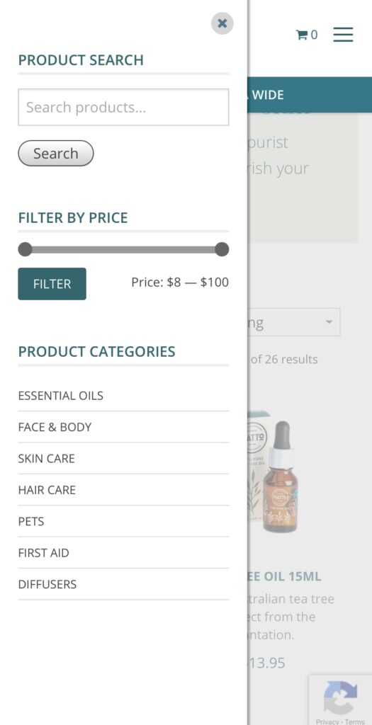
In line with the search function, the filters help your users to find their way through your ecommerce store faster and more easily. With filters, visitors can refine the products in your online store to match their exact needs. Especially on mobile devices, where only a limited number of items would be visible on the smaller screen, it helps if people can filter out sizes, colours or styles that don’t really interest them.
Another big change – and still one of the number one reasons that conversions fall through on mobile devices- form entries. Entering details on a screen can be time-consuming and frustrating, making a lot of visitors leave the platform before converting. A first tip is to include as few forms as possible. Let people visit your website, browse your products and save items without requiring a sign-up process as a member.
Of course, forms are unavoidable at some points. You can’t sell a product or services without people having to fill out some fields. But even here, there are a few things you can do to make this process as easy as possible.
Lastly, there are a few things you can do to improve the usability of your mobile website. First of all, make sure to adapt your design to mobile devices. Whether you chose a responsive design or a mobile website, make sure everything is easily accessible and visible on smaller screens.
Even if your images fit within the screen size, you still have to ensure your users can actually see what is on them. Your users should never have to pinch or zoom to see the actual content, so this means you might have to include expandable images or crop images for mobile use.
Another tip we can give you is that you can include guidelines for your users on how to use your website on a mobile device. You can tell them, for example, to view your website in landscape mode to get a better overview of products or a certain page.
Finally, you want your users to stay within your website’s window. Links that open new tabs are confusing on mobile browsers and users often won’t find their way back anymore to your website. Your website visitors will find it easier to swipe back than to switch tabs on a mobile phone.
To conclude, we would like to include a chapter on mobile marketing in this guide as well. It’s not only your website that should be fully optimised for mobile users, but you should incorporate this mobile-first approach into your marketing strategy as well.
Like we already mentioned briefly in our introduction, the Google search results only show websites that are optimised for mobile. When you’re working out an SEO strategy, your mobile optimisation has a huge impact. You can use free tools like the Mobile Friendly Test to see how your website is performing.
With mobile search results, your local marketing also becomes increasingly important. Google wants to include results that are in close proximity to the user, so especially when you’re running a business with a physical location, you want your local marketing to be on point.
To improve your SEM marketing even more for mobile devices, we can add certain features AdWords has made available for Search Ads on mobile devices. By adding a call extension, users can immediately call your business – leading to a higher engagement rate.
But also on other channels, it’s important to think about the smaller screen sizes. Think about emails, for example, that have to look good on both mobile and desktop screens. Or even just your social media ads, that need to grab the attention of the casual users scrolling through on their smaller screens.
Lastly, think of the extra advantages that mobile can offer. With apps, you can install push notifications, which will get the immediate attention of your users. But also text services like SMS have a very high opening rate and could be ideal to include within your marketing strategy.
What you don’t want to happen
During that 6 minute window of opportunity, they spend their time becoming frustrated and annoyed with your website trying to find what they need, till they reach the point where they abandon the site and search for a faster and better shopping experience with one of your competitors, never to return again.
What you do want to happen
Your website loads fast, and that fast page load speed continues throughout your customers shopping spree as they navigate through your website right through to purchase.
Important Point – A fast website not only contributes to a much higher conversion rate on the customer’s first visit, but is also a massive contributing factor to your customers returning within the next 3-6 months to purchase again.
Scoring a Positive Review
When it comes to eCommerce, everything you do should contribute to creating a raving fan and securing a positive review for your store or product. It’s a fact that people are much more likely to leave a bad review when something goes wrong than they are when something goes right. Everybody hates a slow website, so if you want to increase the chances of scoring a great customer review, you better make sure your website is fast.
So, how do you speed up your website?
Now there are plenty of posts across the internet on the topic of Website Speed Optimisation, so our aim in this resource is to highlight and prioritise the easiest things that you can do, with a focus on websites built using WordPress and WooCommerce.
1. Your product images are too big.
Oversized images are the most common cause of slow loading websites, so sign up for an image optimisation service like Shortpixel. Install their plugin, configure and start optimising the images in your media gallery. But, don’t become too obsessed with image optimisation; you want to find the happy balance between an image that still looks nice and sharp but has a compact file size for faster delivery. Great looking images contribute to a higher conversion rate; blurry, pixilated images do not.
Important Tip – I would suggest generating WEP and AVI versions of your images, which Shortpixil facilitates. WEP and AVI are new types of image formats that will allow you to reduce your image file size to be smaller than that of a JPEG or PNG while still maintaining the quality of the image. Both Chrome and Safari support these modern image formats, which are by far the most common browsers people are using.
2. You are on cheap hosting!
If you have an eCommerce website, you need quality website hosting. Unfortunately, most big-name hosting companies are more interested in squeezing as many websites as possible into a shared hosting environment to make as much money as possible. For eCommerce hosting, you should either be on a dedicated server if you have steady, predictable traffic. Or, if you need the flexibility of scaling up quickly to account for a sudden increase in traffic, Cloud hosting is the right choice for you.A sudden increase in traffic can be caused by one of your products going viral or during a peak buying season like Black Friday, Cyber Monday pre- Christmas etc. With cloud hosting, you can quickly allocate more server resources to handle the increased traffic via a quick phone call to your hosting company.
Important Tip – If you are an Australian based company and need a fast response from your hosting provider, I suggest speaking to the guys at Servers Australia. Their support team is Australian based; they offer 24/7 support and provide various Cloud and dedicated hosting solutions.
3. You’re using an Off the Shelf multiple purpose eCommerce Theme.
If your website was built by an agency that does not specialise in eCommerce, or you built it yourself. Most likely, the website has been built using a multi-purpose eCommerce theme that comes with all the bells and whistles. The problem with this type of theme is that it has been created to appeal to as wide an audience as possible to maximise sales. The result of this (from a coding perspective) is a bloated mess that is extremely hard to optimise and maintain long term; when it comes to performance – less is more. Think of your website as a high-performance race car, every gram of unnecessary weight has been stripped away, leaving just the lightweight parts that are engineered to work together to win the race.You may love the look and feel of your website, so the solution may be that you just need to reach out to an eCommerce Developer to strip down your website and rebuild it without all the extra unnecessary weight slowing it down.
4. Too Many Plugins Installed!
Now, let me firstly state, there is nothing wrong with installing wisely chosen, well-coded plugins to introduce the feature or functionality into your site needed to give it the edge over the competition. But, if you have gone ahead and installed a bunch of plugins, each coded by different developers, each doing a separate task, your website speed and reliability will suffer. If you are reading this resourceful information, you are most likely not a website developer and cannot possibly tell a quality plugin from a bad one. But what you can do is complete a simple plugin audit yourself. Login to the backend of your website, review all the plugins that have been installed and deactivate the ones that are not needed. Then check the site’s functionality is not affected and delete the deactivated plugins. By deleting the unnecessary plugins, 90% of the time, you will have contributed to speeding up your website.
Important Tip – If you find a lot of outdated plugins, either update them or remove them, as outdated plugins pose a significant security risk to your website, making your site more vulnerable to hackers.
5. Use a Content Delivery Network (CDN)
By incorporating a CDN, you can significantly reduce your website load time, especially if it is image-heavy like an eCommerce website. In simple terms, the benefit of a CDN is that it will load your website content from the nearest data centre to your customer. So, for example, if you are an Australian based company selling in the USA and a customer from California is shopping on your website, you would want the website loading fast from the nearest data centre in the USA, not from Sydney, Australia.
Important Tip – Choose your CDN wisely, make sure it has data centres in the countries you are targeting and make sure it is a paid service. There are risks with using a free CDNs service, as some countries have internet providers that block free CDNs as it loses them revenue. The two largest Telecommunication companies in Australia are guilty of this, forcing websites to load from overseas data centres without you knowing. But if you are paying for the CDN service, that means the telcos are getting a payment passed on, and your website is much more likely to load from the location-specific data centres as expected.
In conclusion
The five points listed above are items you can largely do yourself. However, beyond this point, further optimisation becomes a highly technical and specialised skill, where you need an experienced developer with solid experience optimising websites, which is where we excel.
If you would like to discuss further how we can assist you in speeding up your website, please feel free to book in a call to discuss further.
Look, we get it. It can seem intimidating to Invest in a Custom Website Design.
It can be tempting to purchase an out-of-the-box website template. They’re often inexpensive and can be set up in only a few days. But the truth is a custom website will always provide more value to your business in the long run than a template site.
That’s why it’s crucial to view your website is an investment, not an expense. In the same way that a great employee or a great store location will eventually pay dividends, the same goes for your website.
Why is that?
Here are six reasons why every business should invest in a custom website design with Fox & Lee.
The most obvious benefit to custom web design is the ability to highlight what matters most to your business. Whichever features matter most to you and your customers, you can display them front and centre.
And consider this: what matters most to you today may change tomorrow.
Any business owner understands that a business is constantly evolving. Whether it’s a new product, a new brand, or a even a new core focus, the strongest businesses are those that can pivot when the market calls for it.
A template website is confining. Even if you found a template that worked for you before, you may find yourself permanently cemented in that solution, unable to change.
Your adaptable business needs an adaptable website that can keep up with your demanding business needs and your demanding customers.
With a custom website design, you have full control and true business independence to make any custom changes required—no matter how small—to make sure that your business is never held back by your technology.
Modern marketing is all about branding. Actually, it always has been.
While your business offering may be better than your competition’s, the strength of your brand is what gets people in the door.
With a templated website, your ability to stand out from the pack will be handcuffed. When potential customers see a cookie cutter website, they see a cookie cutter business.
With a custom website design, you are far more able to showcase the true power of your brand and what makes you unique. A beautiful website design with a strong, focused brand promotes your business as more reliable, more professional, and more compelling.
A great web designer will work with you to make sure that all the best aspects of your branding are reflected in your website to make sure your visitors truly understand who you are and what you do.
Just as you should strive to give every customer a tailored, personal experience in your day-to-day business dealings, you should strive to do the same with your website.
A one-size-fits-all website solution is unlikely to give your particular customers the unique experience they deserve.
With custom web design, you can tailor your website to your customer—because you know them best.
Whether it’s a unique landing page layout, a clear navigation architecture, a highly responsive design, or an intuitive user funnel, your website needs to provide a great experience at every step of the way.
Because every interaction with your website is an interaction with your business.
Technology changes fast. It’s no different when it comes to web design.
The way people use the web is constantly changing, whether it’s newer phones, changing browsers, or other unexpected contenders entering the scene.
With a custom website design, you can stay on top of that change to ensure that your site visitors—and potential customers—are always getting the most modern possible browsing experience.
The most important search engine ranking factors can all be positively influenced by a custom website design. Especially a custom website studio that understands modern trends in SEO.
The most important ranking factor has always been the number of high-quality links pointing to your website. Nothing earns more links than a beautiful, compelling website design.
More recently, Google’s search ranking algorithm is placing more value on websites that provide an incredible user experience thanks to unique, engaging content.
Factors like the time a user spends on your site and how many pages they interact with are now taken into account when ranking your site in search results.
So the more you can “wow” your site visitors, the more likely you are to positively affect the signals that Google cares most about—boosting the number of visitors your site and therefore boosting your business.
Ultimately, you’re in business to make money. With every business decision you make, you should be asking yourself if that decision is contributing to your bottom line.
Therefore, you should treat your website the same way. Is your site simply an online business card, or is it powering your business?
When it comes to web design, a customised design is always going to generate better ROI.
Every previous benefit on this list has been building to this point. Having a custom website will draw more potential customers to your site, provide a better customer experience once they’re there, and ultimately convert more visitors into business.
That’s why it’s wise to view your website as an investment rather than an expense. A powerful website will pay itself off many times over by working for you to generate new business.
At Fox and Lee, we create beautiful solutions. Our Melbourne-based custom website design firm understands what it takes to translate a successful business into a successful website.
Ready to get started? Click here to fill out our web form now
Here at Fox and Lee, we are a proud member of our local community. When Melbourne based Businesses are looking to grow themselves with eCommerce Web Development, we are happy to lend a hand.
We offer expert design and advanced development specialities (such as CS-Cart mastery). Thus, you can trust us to transform your online presence to a strategic representation of your business.
We are committed to being apart of your online journey. We support your business as it grows online and different opportunities arise.
Here are three of the many examples of eCommerce Web Development where we developed a web solution for local businesses.
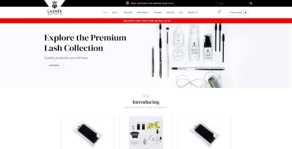
Lashes Australia is an exclusive online supplier of quality lash products. Upon visiting, you’ll notice they proudly express their core values of great customer service quality product throughout their website.
This design is bright and clean and highlights their product. Similarly, messaging is clear with key promotional details highlighted using impactful banners. Language including ‘Premium’ and ‘Quality’ reinforces their brand promise.
By including a page about ‘Lash Tips’ Lashes Australia position themselves as an expert in the industry. Additionally, they invite reviews on each product in their range. Lashes Australia is proud of its brand and products. Hence, they let that shine through with their online presence.
Lashes Australia is a wholesaler of lash extension and accessories. The transparent nature of the features included in their eCommerce web design reinforces the integrity of the brand. As a result, this speaks to their target audience, being businesses and professionals in the industry.
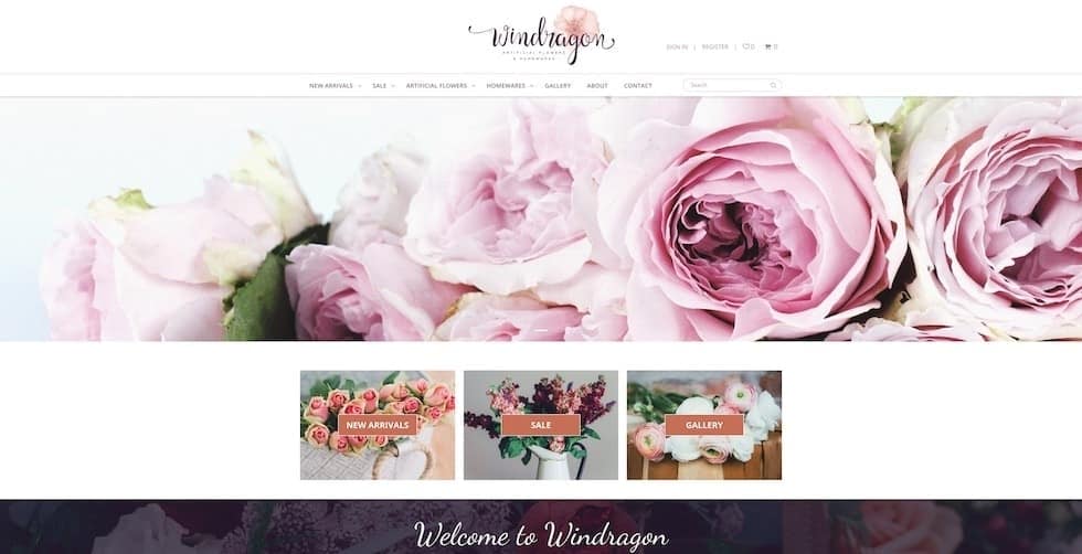
Windragon let pictures of their products do the talking on their homepage. Beautiful flowers are everywhere you look. The use of imagery acts as a strong selling tool.
Windragon’s website features an easy to navigate menu system. They’ve also included a Gallery in their web design that showcases their beautiful artificial flowers.
This website is customer-centric and makes getting in contact clear the user. The customer service provided with a user-experience focused design represents the company’s values in a digital format.
The ordering system was a key part of the development of Windragon’s website. Because of this we sorted out the backend for them and left Windragon with an easy to use web experience.
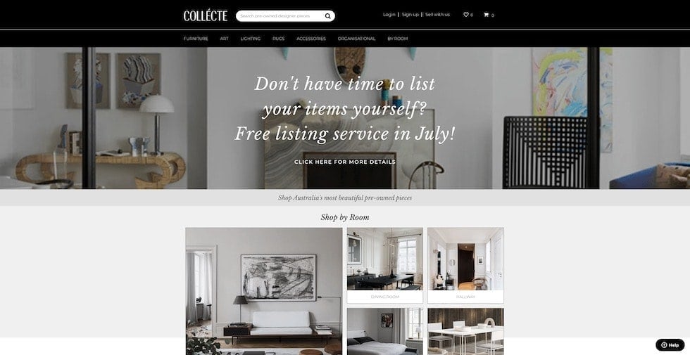
Collecte had the great idea of setting up a marketplace that focuses on preowned designer furniture.
As a Multi-Vendor eCommerce website, Collecte balances both customers and vendors landing on their homepage. Easily identifiable paths of navigation are laid out to both audiences. For example, separate help centres exist for vendors and customers in the footer of the page. Collecte manages dual requirements with specific functionality catered to each audience.
Their website’s integrity is managed through a range of features, such as a review system for vendors and an approved list of designer categories eligible for selling on the site.
Additionally, their website design incorporates a range of elements that make their website unique. Attention to detail positions Collecte to meet their customers needs no matter how varied they may be.
The best part of this website is that with all these moving parts, Collecte still feels undemanding and natural to navigate for the user.
Collecte launched this year. We’re excited to see how they grow and develop as more people discover this one of a kind website.
Here at Fox and Lee, we create Strategic Digital Solutions and Ecommerce Sites that elevate your business. We think your website deserves better than a template.
We’d love to be a part of your eCommerce Web Design website design. Please get in touch with us on 03 9043 1039 or by completing the form below.
Related Reading: 5 ways to make your ecommerce solutions more profitable
Before you decide to invest in Childcare or Daycare website Design, there are many things to consider. At Fox and Lee, we build custom websites that reflect your personality and what makes you special.
Families care about their relationships with people who spend time with their children. Personalising your digital presence allows you to properly introduce yourself before they have even stepped through the door.
When you work with Fox and Lee we take the time to understand your business and what makes you unique then make sure this reflects online. We also know it’s valuable to think about what’s important to prospective parents.
When we design and develop a website for your centre, we find the perfect harmony of conveying what you need to say, with what your customers need to hear. The combination of this focus paired with our expert design results in a website that sells your centre to prospective parents.
Your curriculum is one of the most important things to include on your Daycare website. It provides prospective parents with insight into your centre’s teaching philosophy and how their children will be educated through play-based learning
Outlining your curriculum online helps you stand out from competitors. You can show parents the developmental and educational advantages that come with enrolling in your centre.
Parents want to ensure their children will be fed a healthy and nutritious diet, this information must be displayed proactively and clearly to address this concern.
We love how Beachwood Early Learning uses a dedicated page to reassure parents that all allergies, intolerances and dietary restrictions will be catered for in their centre. They’ve shown initiative and answered a key question for many parents with their web design.
Bambini’s enrolment pages communicate the process for enrolling in one of their centres. They also have multiple easy to find ways for the visitor to contact them directly or book a tour online.
Parents are more likely to contact centres that make finding and understanding information regarding enrolments clearly accessible.
As with the previous point, your contact information must be easily found on your website. Contact information should be made convenient for the user within the Daycare website design.
We like to include ways to get in touch in your header, footer and on a dedicated page to make sure the people who have begun to fall in love with your centre can give you a call immediately.
As you would know, your biggest competitors are the other Childcare centres around you. When you work with Fox and Lee we can offer a range of solutions to give you a competitive edge.
Search Engine Optimisation (SEO) can be integrated into your website to help you place above competitors on Google. Good quality SEO takes time, and the investment in building your organic position in search results has a massive pay off.
Search Engine Marketing (SEM) allows you to buy the space at the top of search pages for phrases we know your customers use. We’re able to generate leads to your website and measure return on investment with SEM.
We’re happy to help you get your website in front of more customers with our digital marketing solutions.
Admittedly, with proud parents in our team, we love working with Childcare and Daycare centres to build strategic and personalised web solutions.
Bambini Early Learning Centre and Beachwood Early Learning are just two examples of the many ways we can bring your centre to life online.
We’d love to be a part of your daycare website design. Please get in touch with us on 03 9043 1039 or by completing the form below.
"*" indicates required fields
Online Shopping is very popular at the moment. Consumers needs have changed and a lot of businesses have had to change the way they do things to survive through the COVID-19 Outbreak. We’re hearing a lot of questions about whether online shopping will continue at the same pace after local lockdowns end and the pandemic is resolved.
We’ve looked at Google Trends and compared some keywords to see what consumers have been looking for over the last 12 months. This helps to show us how people were shopping before and what’s happening now.
Understanding the demand for online shopping can help when considering a custom ecommerce website for reaching new customers.
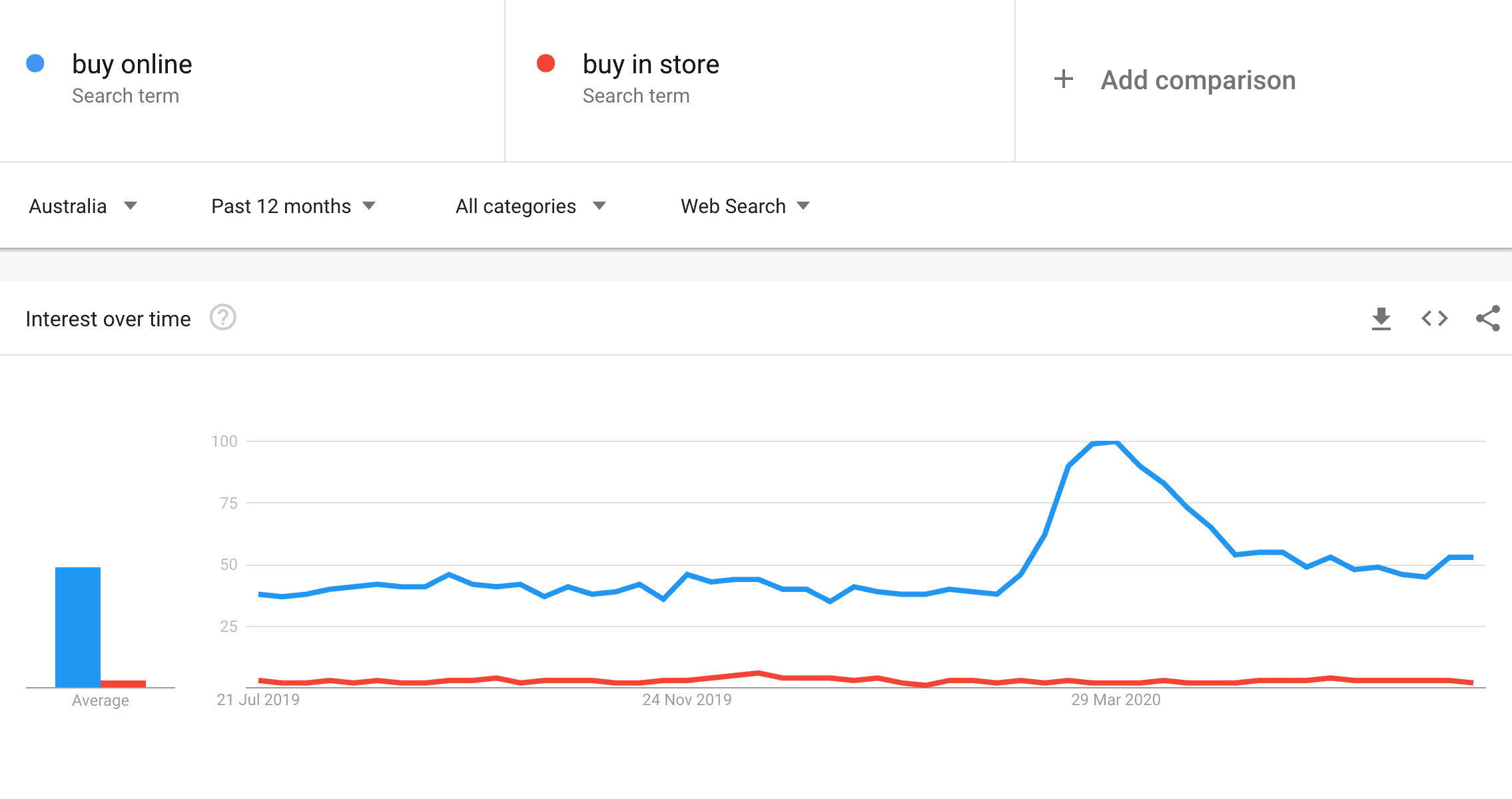
The trend is really easy to read here. For ‘buy online’ you can see that after the peak brought on by the first wave of restrictions that search traffic has still maintained at a higher level than where it previously sat.
Across Australia people have been looking for things to ‘buy online’ more than ‘buy in store’ consistently over the last 12 months.

A very similar trend on this comparison. Omnichannel retailing has become increasingly more popular in recent years. While both ‘delivery’ and ‘click and collect’ involve visiting a website, delivery allows customers to not have to leave their home. So unsurprisingly delivery has been incredibly popular through the COVID-19 Outbreak.
As with the pervious example, a years worth of data shows that customers have been happily engaging independently with a company’s website for some time now. The interest in delivery seems to be still growing. It’s an opportunity for your store to reach customers wherever they exist.

Search traffic for customers looking for an ‘online sale’ has peaked and dropped over the last 12 months before positively settling in recent months. A small peak of interest for ‘in store’ sales can be seen at Christmas. Comparing this to the traffic for ‘online sale’ seems unfair but it’s relevant.
People looking for sales in stores are seasonal, but the data shows people are nearly always looking for sales online. We think this is a huge indicator for why online shopping will continue at a similar rate after lockdowns are lifted.
The COVID-19 Outbreak can be very stressful for those managing a business. You may be conflicted about whether it is a good time to adapt your business model and expand your digital presence.
Your customers are online, and they aren’t going anywhere, anytime soon.
With all the support available to Victorian businesses it is a great time to invest in an innovative online shopping experience to engage more customers.
Once you’re ready to get started you can contact with us on 03 9043 1039. Alternatively you can fill in the contact form below. We’d love nothing more than to play a small part in helping your business grow online.
"*" indicates required fields
We know from Google Trend analysis that online shopping isn’t going anywhere and it’s more important than ever to be thinking about your online presence. Maybe this is something you’ve been thinking about for a while, but the cost to build a website can be intimidating. Your business and your brand are important, so the investment of time and money in a good quality website should be a key element in your COVID-19 recovery strategy.
The digital experience you give your customer should be at the same level of great service you give your customers face to face.
We’ve done some research to list where you can find different Government grants and programs that could potentially contribute to your budget. Hopefully this can help bring the dream of a beautiful new website a little bit closer to a reality.
As an example, for us here in Niddrie the City of Moonee Valley the local government is offering $10,000 grants for Adapting to Changing Needs.
This includes online innovation, web design and redevelopment, ecommerce platforms, mobile app development. We’re currently working with local businesses who are applying for these grants and taking the opportunity to discover new customers waiting online.
The Victorian Chamber of Commerce has put together an Employer Guide for COVID 19. It is regularly updated and includes changes to the Modern Award. That’s something every Victorian business owner should want to be aware of.
While you won’t get a cash injection reading this guide, it helps prevent legal costs or fines that could take away from any budget you’ve put aside to cover your costs for building a website.
GrantConnect is a portal where you can review a variety of different grants. They come from different states, industries and programs. Each grant covers useful details such as categories, close dates and eligibility criteria.
This is a great place to find any niche grant opportunities you many not have been aware of specific to your industry.
When Victoria went to Stage 3 Restrictions again on the 8th of July the Business Support Fund was extended. What does this mean for you? If you’re already getting JobKeeper there is now another $5,000 grant available you can currently apply for.
One suggested use of this grant is “developing the business through marketing and communications activities”. We can’t think of a better way to achieve this than updating your website to generate new customers.
Leave no stone unturned. The grants and programs portal at Business.gov.au asks you a few questions and then generates a list of grants specific to your business.
While this list is shorter than the one at GrantConnect it is another place to regularly check for resources that may be available to you.
Depending on eligibility grants might not be an option for you. We know the investment of a strategic and stunning web presence will play a key role in how you operate post the COVID-19 outbreak.
That’s why we’ve included the Coronavirus SME Guarantee Scheme. This scheme gives you an opportunity to get an unsecured personal loan that includes an initial 6 month repayment holiday.
Victorian businesses are eligible for various tax relief measures as a result of COVID-19. If you haven’t already lodged your tax for the last year it’s worth reading up on.
You can use your tax return as an opportunity bring in some extra cash. Any extra budget could be put towards the cost of building your website.
We hope you found this list helpful, but we aren’t experts in government stimulus. We’re experts in custom web design. Eligibility criteria, close dates and other relevant information can be found on the linked websites. It’s worth looking into and seeing if there is anything you’re not currently getting that you’re entitled to.
If improving your online services is part of your COVID-19 Recovery Strategy we can help with stunning bespoke web design, development or custom ecommerce solutions.
Once you’re ready to get started you can contact with us on 03 9043 1039. Alternatively you can fill in the contact form below. We’d love to be a part of making your website a beautiful reflection of your business.
User Experience refers to the experience people have when they visit your website or use your app. Think about a website or app that you use frequently. Is it easy to find what you are looking for? Do you sometimes complain or get frustrated when browsing the website? Have you at one point left the platform because of this? Or did you end up leaving with satisfaction, having found exactly what you needed?
All of this refers to the user experience. Web developers and designers have as their main goal to make the website as easy and pleasant as possible for users. You can apply this to a lot of different aspects of your website, ranging from the products you offer to the delivery services you have in place. What we’re going to focus on in this guide, is the user experience that is created by the web design.
People want to have a pleasant experience when they’re visiting a website or app. This means that they are more likely to stay on your page and go through the whole conversion funnel. When they experience things that they don’t appreciate, they might leave without having completed their goal.

Your user experience is important for your conversion rates, it’s important for your SEO (Google loves good UX) – but most of all, it’s important for your actual users. Having a user-centric design will ensure your website visitors have the best experience possible on your site, making them come back for more.
To create this positive experience, your design should be intuitive and it should meet the users’ needs. The information should be clear and simple, and the users shouldn’t be distracted by non-useful items. There are a few principles of UX design that we want to talk about, so you have a better understanding of the concept of UXD.
 Now look at the home page of Amazon, where everything is organised well
You want your customers to know exactly where they are in their journey. Your design should offer them guidance, so users know where they are on your website and what the next steps should be. Offering guidance to your users can be done through familiar patterns, that they already know how to use.
Buttons, for example, take them to other pages, arrows take them backwards or forwards and your logo makes them return to your homepage. By implementing these principles on your website your users will find it easier to navigate and they won’t waste any of their precious time on your website.
Your users don’t like interacting with machines. By offering them a personal experience you will gain their trust and you’ll be able to build a deeper connection with them. It also offers you the opportunity to show your brand’s personality.
Examples of offering a personal user experience include implementing features like chatbots, where you can offer live assistance on your website, or customer reviews, where they get another human input. But even simplifying certain processes on your website can lower the robot-aspect and add a more personal experience.

And that brings us to the third aspect of user experience. UX should always be straightforward, offering your users an enjoyable experience. This means you should avoid clutter at all times, removing every unnecessary aspect on your website.
And when we say that you have to remove the fluff on your website, we’re also talking about your content. Having unnecessary content on your page might distract your customers or confuse them, making them want to leave.
“Get rid of half the words on each page, then get rid of half of what’s left.” — Steve Krug
A good way to keep your website as easy and simple as possible is by creating consistency. Ensure your menu is always in the same place, your buttons look the same and your branding is consistent.
We know what UX stands for (User Experience). But chances are high you’ve also seen the term UI passing by somewhere. Although closely related, those two are not the same thing. UI refers to the user interface and includes the more visible part of your website.
Since the user interface plays an important role in the overall user experience of your website, we will focus on some important components of the user interface in this chapter. Understanding what’s important for the user interface will give us a better understanding of user experience design and how this will take form in the user interface.
Simply put, UX refers to the structure of an app or website, while UI has everything to do with a website’s look. The name speaks for itself: UI refers to everything that a user interacts with – be it as buttons, keyboards or icons.

Say you have a website where you can find information about certain touristy places in Australia. The way the website works, looks and feels all contribute to a good user interface. It’s easy to select your desired destination and the information pulls up quickly. The fact that your overall user experience isn’t good, might be due to the fact that the website only includes the major destination, which means you can’t find any information about the place you wanted to visit.
Your UI and UX should work together, and we should optimise both to you guarantee a good website experience for your visitors. We’ll have a look at some aspects of UI now that are a good example of how your user interface contributes to a better experience.
Breadcrumbs are a way of offering users visual guidance on the website in order to increase its usability. Navigational breadcrumbs show users exactly where they are in the hierarchy of the site and make it easy to go back to a different category or part of the website. It’s often used in ecommerce websites to show what category the user is viewing at the moment. Breadcrumbs don’t require expert design skills but often just consist out of words and arrows.
Input controls are mostly found on the website’s forms and refer to every feature where users have to reply to a question. This can be a text field, a dropdown list, toggles, buttons or a file input box.
To keep input controls on your website easy-to-use, you have to make them as simple and clear as possible. Ask only for the information you really need and don’t scare your customers away with dozens of questions to fill out.
Informational components are elements on your website that offer users more information on an action or a page they’re viewing. Examples are loading bars, notifications or messages – to clarify if an action is completed or if other actions are required.
You’ll see that the concept of UI and UX are very closely related, and it’s almost impossible to talk about UX without focusing on the user interface. We’ll talk more about user interface later on, but we’re first going to focus on some other aspects of UX.
When you focus on the experience for your users, it speaks for itself that you have to start by figuring out who those users are. By conducting extensive user research, we can define our customer group and get an idea of their needs and pain points. With this in place, we can make strategic design decisions, without any guesswork involved.
To get an idea of who your customers are, it’s recommended to build buyer personas. Personas are highly stereotyped characters that represent a certain group in your target audience. In these personas you can include their need or problem they want to solve, and what they would expect from your company.
Once you have a user persona in place, it’s time to look at the journey they go through when they interact with your product. By mapping out every step, it helps you identify the different ways users can reach their goal.
The journey will often consist of a number of web pages and decision points that carry them from one point to another. Understanding how your users interact with these different steps will give you a good idea of what aspects of your website should be in place to complete the journey.
Another important aspect of UX is the usability of a product. This means we have to measure and understand the extent to which users can achieve their goals easily with your website. And by optimising these processes we can guarantee better effectiveness, efficiency and satisfaction.
We know it might sound a bit vague, but let’s look at this image of poor usability design.

Although this watering can might look pretty and is usable when it comes to holding the handle, it’s usability is very poor when it comes to watering plants.
Usability varies depending on the intent of the user because this watering can would function well if the user had the intention of watering the can itself (are you still with us?). Same goes for usability on a website, where the user’s intent and its environment determine the level of usability.
Even though usability is one of the most important aspects of UX, your visual design might even play a bigger role in this. Research has shown that post-use perceptions of both aesthetics and usability are highly influenced by a system’s aesthetics. We know people are attracted to things they find aesthetically pleasing, so this will obviously impact the way they perceive a website’s usability as well.
Visual design is a mix of graphic design and user experience design and focuses mostly on static images. It includes items such as illustrations, photography, typography, spacings and colours used to enhance the user experience.
We found another example for you to illustrate the importance of web design. This website has a very poorly chosen colour scheme, which doesn’t only make it hard to read some of the text, but also just isn’t aesthetically pleasing.

When we look at the design of this ecommerce store at the other hand, we notice soft colours with a high enough contrast and lots of white space.
 Source: Natto
Especially for ecommerce websites, minimalistic web design is highly important. By simplifying your design, the focus will be on your products – and there’s less chance of your customers getting distracted by too much additional information. Other visual items such as high-quality pictures and organised category pages will not only be pleasant for users but will also increase your conversion rate.
When you start to build something, you usually begin by contacting an architect who develops the structure of your house. Similar to buildings, information online also has a structure in place – beginning with a solid foundation from which you can start building. By structuring and labelling content on your website, information can be found easier.
Information Architecture (IA) is the beginning of your UX. You can consider it as some kind of blueprint, which web designers will use to build sitemaps, wireframes and navigational menus. It’s all about organising the information in a clear and logic way and UX designers can use a different system to structure everything.
 Source: Adobe
Information architecture can be challenging when it comes to platforms with a lot of data, such as an ecommerce store. Nevertheless, you should think about a solid structure to categorize your products and to ensure customers find what they’re looking for. That’s why we dedicated a whole article on ecommerce structures, that you can find here.
Interaction design is a discipline of user experience that focuses on the interactions users have with a website or app. Here too, is the goal of interaction design to make it possible for the users to achieve their goal in the best way. Interaction design overlaps a lot with the visual design, but also refers to buttons, error messages or even the physical objects (like a mouse or finger) that users use to interact with certain elements.
Now we’ve talked about UX and some of the different aspects of UX. Like you probably noticed, a lot of these terms stay quite vague and often overlap with each other. Hiring a web design agency is the best solution if you need assistance with the whole user experience, going from user research to developing wireframes.
Let’s have a closer look at the UX process, so you can understand the different steps you have to take in order to create a great user experience for your website.
Just like the development of a marketing strategy or branding strategy, your user experience should start with researching your target market and industry. Understanding your own industry and what the common practices are, will give you a head start when designing your own UX.
Looking at your competitors will help you discover different ways to enhance your own strategy. Compare at the visual design, interaction design and usability of the websites of your biggest competitors and create a competitor analyses sheet with their biggest strengths and weaknesses.
But research doesn’t only refer to other websites in your industry – you should also look at your own product. Usability testing will help you to evaluate how successful your own website is. To discover what’s working for users and what needs improvement, it’s best to test your product on actual users. There are different tools to check your website’s usability – like Hotjar or Crazy Egg – that will give you a good understanding of how people interact with your site and what they click on.
When we have an understanding of our industry, we should take the actual users under a loop. We can define User Experience as making the whole experience as pleasant as possible for users. So we need to know who these users are.
We already mentioned user research in a previous chapter, but what we would like to add here, is that we shouldn’t just study the users, who they are and where they come from, but also their specific goals. Usability depends on the intent of the user, so we should simplify the process of reaching their objectives.
An ecommerce website, for example, is mostly visited because people want to buy something. This means we should optimise the structure of the website so people can quickly find the right products. The visual design too should be clear so people can easily discover the buttons to add items to their shopping cart. And lastly, we should improve the interaction design so the check-out process won’t confuse customers.
If we, however, say that the intent of the user is to find information (which is also often the case with ecommerce websites) we have to optimise different aspects. Examples include adding clear and organised product details and high-quality pictures that allow you to zoom in. Going over all these types of users and their different intentions will help you shape an idea of what is necessary for the user experience.
Then it’s time to gather the first ideas. With the user journey in mind, you can start with designing user flowcharts, to analyse the different steps users go through in the process.
 Source: UXdesign[/caption]
This is also the phase where you think about your information architecture, and thus the different structures you can use to organise your website. You should define categories and subcategories and ensure all the information can be organised in a clear way.

These steps will be the important groundwork for your website. It will help you create hierarchy needed for internal links and navigational menus.
Once we’ve organised everything and have a clear overview of all the categories you can start making some first sketches. Visualising this will help you see your website or app getting more concrete.
Wireframes are a visual representation of how the information is organised on key screens. The provide the skeleton framework and show how you arrange interface elements.
Wireframes don’t focus on what something will look like, but rather on its functionality. You don’t have to include any details but focus instead on the organisation of information, the hierarchy of content and how users will interact with every step.
Now that we have our blueprint, it’s time to get creative. Enter the design work: it’s time to make decisions regarding colours palettes, images, fonts, icons and animations. Before you start, we recommend creating a mood board first.
Moodboards are a great way to give you some visual inspiration. You can collect colour palettes you like, icon designs you find fitting or even just images or fonts you think would work well. You can look at your competitors or even just look at other non-related brands you find visually attractive and place everything together. Collecting your ideas in a mood board will give you a better general overview. And this will definitely spark some ideas when you reach the designing phase.
 Pinterest is a great tool for creating mood boards
Your design process will be trial and error. There are so many different ways to visualise your original wireframe. We recommend playing around with colours, fonts, button sizes and images as much as possible before reaching the final design.
Of course, you have to be sure everything works the way it should. Once you have your prototype ready, it will be subject of many user tests. During which you can focus on both the aesthetic features and usability. Look at how your testers interact with your website to figure out if they understand the way you intended it to work. Designing a website or app comes with a lot of testing and adjustments until you have the final work-ready.
Interaction design is an important aspect of your User Experience (UX), where the focus lies on all the interactions users have with a website. By creating the best possible interactions between your users and your product, your customers will be able to achieve their goals quicker and have a better overall experience on your platform. Interaction design focuses on aspects like the motion, sounds, the space and aesthetics of your interaction elements.
Gillian Crampton Smith introduced 5 dimensions of interaction design, that will clarify the concept a little bit.
But how do you create optimal interaction design for your users? We’ve asked our expert user experience designers and web designers to give us an overview of their best tips when focusing on interaction design.
First of all, you want to create an experience that is enjoyable for your users. So you should keep your users’ need in mind. Important is here to work with familiarity: use patterns that they already know in order to avoid confusion. Work with buttons, process trackers, arrows and other easy-to-understand features and use understandable language to guide them through their interactions.
When you’re creating certain interactions your users will experience, you should always try to keep it as simple as possible. Don’t show off your skills by adding unnecessary animations, steps, words or buttons. Instead, build a trustworthy relationship with your customers where they know what’s expected from them. This also means you should create consistency across all interactions. For example, when people can slide up to reveal a certain element, they should be able to slide down in order to hide it.
Source: UXdesign[/caption]
In order to understand how your users will interact with your product, you can create storyboards to outline the user flow. Your storyboard maps out every step your users take and how different decisions have different outcomes. You can visualise this by creating a sequence of the different screens and then check the fluidity in which the user experience happens.
Once you have created your User Interaction elements, you should see how your actual users interact with it. Before releasing it to a big audience, it might make sense to test it on a small focus group to see where there’s room for improvement. Follow the movement of their mouse or fingers and discover every step that seems unnatural or where they have a different interaction with your product as what you originally intended. Keep testing and improving until you’ve created an interaction that works perfectly well.
Interaction design is a very specific branch of User Experience. Even though it might all seem very obvious to you, there are so many little twists and tweaks that you should implement when you’re designing a new website. For example, did you know that adding the option to view or not view your password will decrease the number of dropouts? Simple little changes like that could have a huge impact on your conversions! Best is to hire an expert who knows UX inside and out – and we happen to know somebody like that!

Need some help with the interaction design or UX on your website? Talk to us!

")


