Online shopping is no longer a convenience—it’s a daily ritual. In Australia alone, over 9.5 million households made an online purchase in 2024 (Australia Post eCommerce Report 2024). From groceries to electronics, fashion to furniture, customers have come to expect quick delivery, seamless transactions, and responsive websites. For businesses, this represents both a major opportunity and a challenge. Creating a successful eCommerce presence is about more than putting products online—it requires strategy, technical precision, and user-first design.
Choosing the Right eCommerce Platform
Shopify
Shopify is a user-friendly SaaS platform with an intuitive interface, ideal for small to mid-size businesses that want to go to market quickly. It offers strong integrations with social media, apps, and POS systems.
Pros:
Excellent for quick setup
Great app ecosystem
Reliable and well-supported
Cons:
Costs add up with apps and themes
Limited control over checkout and backend
WooCommerce
WooCommerce is an open-source plugin for WordPress that gives merchants full control over design, functionality, and scalability. It’s perfect for SEO-focused stores, businesses that want flexible product setup, or anyone needing tailored functionality. WooCommerce stands out as the best platform for businesses serious about owning and growing their online presence without limitations.
Pros:
Total control and flexibility
Huge plugin ecosystem
Excellent SEO capabilities
Cost-effective in the long term
Cons:
Requires technical know-how or support
Responsibility for hosting and maintenance
Magento (Adobe Commerce)
Magento is designed for enterprise-level sellers with complex needs—multi-region, multilingual, or large inventories. It supports deep customisation and robust performance but requires dedicated development resources.
Pros:
Built for large-scale eCommerce
Customisation without limits
Cons:
Complex setup and management
High development costs
BigCommerce
BigCommerce strikes a balance between Shopify’s simplicity and WooCommerce’s flexibility. It includes more features natively, which can reduce reliance on apps.
Pros:
Strong built-in features
No transaction fees
Cons:
Less flexibility with templates
Steeper learning curve than Shopify
Squarespace / Wix
Squarespace and Wix are beginner-friendly platforms with drag-and-drop functionality. While fine for launching a simple store, they lack the deep eCommerce capabilities required for scaling.
Pros:
Easy to use
Stylish design templates
Cons:
Not suited for complex stores
Weak integrations and SEO tools
Payment Processor Options
Stripe
Stripe is a popular choice thanks to its powerful developer tools and seamless checkout experience. It supports subscription billing, multiple currencies, and mobile wallets.
Buy Now, Pay Later services like Afterpay and Zip appeal to budget-conscious consumers and drive higher cart sizes. However, the merchant fees are among the highest in the industry.
Mobile wallets like Apple Pay and Google Pay streamline the checkout process for users on mobile devices.
Pros:
Fast and secure checkout
No additional merchant fees
Cons:
Requires compatible devices
Limited to customers with accounts
Shipping & Fulfilment
Integrated Shipping Platforms
Integrated shipping tools help automate order processing, label generation, and tracking.
Sendle offers affordable carbon-neutral delivery across Australia. Australia Post MyPost Business is reliable and familiar to Australian shoppers. Shippit and ShipStation allow access to multiple carriers from one dashboard.
Pros:
Automates fulfilment
Reduces manual admin
Connects with major eCommerce platforms
Cons:
Some platforms charge monthly or per-label fees
May need trial-and-error to find the best carrier setup
Warehouse & 3PL Considerations
Outsourcing warehousing and fulfilment helps businesses scale without expanding physical operations. Third-party logistics providers like eStore Logistics, Fulfilio, or Amazon FBA handle everything from storage to shipping.
Pros:
Reduced internal workload
Faster shipping and fewer delays
Can scale with demand
Cons:
Less control over packing and customer experience
Initial setup and per-order costs may be high
POS & Inventory Integration
A strong POS system connected to your online store keeps inventory accurate across all sales channels. Square POS integrates with most eCommerce platforms, while WooCommerce users can rely on plugins like FooSales or Point of Sale for WooCommerce.
Pros:
Real-time inventory tracking
Streamlined reporting across locations
Unified customer data
Cons:
Additional software or subscription costs
Setup complexity varies by platform
Marketing Tools & Integrations
Email Marketing & CRM
Email marketing is essential for nurturing customer relationships and increasing lifetime value. Klaviyo offers advanced segmentation and automation. Mailchimp provides easy drag-and-drop campaigns. HubSpot and Zoho CRM go deeper with contact management and integrated marketing.
Pros:
High ROI from personalised messaging
Automated flows drive repeat purchases
CRM tools enable better targeting
Cons:
Poor segmentation can reduce results
Requires ongoing testing and list management
SMS Tools
SMS campaigns are short, impactful, and often see instant results. Tools like Postscript and SMSBump connect directly with Shopify and WooCommerce.
Pros:
High open and click-through rates
Great for time-sensitive offers
Cons:
Limited message length
Can be seen as intrusive if overused
SEO Tools
SEO drives long-term organic traffic. Yoast and RankMath are ideal for WordPress users. SEMrush provides broader keyword and competitor insights.
Pros:
Improves visibility and traffic without ads
One-time effort pays long-term dividends
Cons:
SEO takes time
Requires knowledge and patience to execute properly
Paid Ads & Remarketing
Digital ads are key to capturing and converting traffic. Google Ads targets buyers actively searching for products. Meta Ads allow for advanced segmentation and dynamic product ads. Pinterest and TikTok help generate brand awareness and social engagement.
Remarketing keeps your brand top-of-mind. Install tracking pixels like the Meta Pixel and Google Ads Tag to deliver targeted messages to users who browsed but didn’t buy.
Pros:
Quick way to drive traffic and sales
Highly measurable and scalable
Cons:
Can be expensive without a clear strategy
Needs constant testing and creative refresh
Know Your Audience: Using Personas to Drive Strategy
Effective strategy is built around customer understanding. Develop buyer personas to define your audience’s demographics, preferences, and behaviour. This informs everything from homepage layout to marketing messaging. Personas should be refined regularly based on data and feedback.
Pros:
Creates more relevant content and offers
Increases marketing efficiency
Cons:
Time-consuming to create initially
Can become outdated if not reviewed
Creating a Competitive Edge
With thousands of stores online, it’s vital to differentiate. Offer perks like free shipping, bundles, urgency triggers (e.g. timers or stock warnings), and loyalty programs using tools like Smile.io or LoyaltyLion.
Pros:
Increases conversion and repeat business
Enhances brand loyalty
Cons:
Can reduce margins if not carefully managed
Visual Content & Product Listings
Well-optimised listings convert better. Invest in professional product photography, lifestyle imagery, and concise, benefit-driven descriptions. Use reviews and ratings via Judge.me or Yotpo for trust.
Pros:
Boosts credibility and conversion
Reduces return rates
Cons:
Upfront cost for quality assets
Ongoing Review and Optimisation
Your online store should evolve with your audience and analytics. Use Google Analytics 4, Search Console, Hotjar, and A/B testing tools to understand what’s working and where improvements can be made. Schedule regular reviews of performance, marketing ROI, and site health to ensure your store is always improving.
Pros:
Ensures long-term growth
Identifies and fixes issues quickly
Cons:
Requires time and consistency
May need professional input for deeper analysis
Build it Right: The Case for Custom Website Development
Benefits of Working with a Professional Agency
Partnering with a professional agency gives you access to deep expertise in website design, development, and digital strategy. Agencies understand user behaviour and can craft a site tailored to your customer journey—from homepage to checkout. Custom sites also enable performance optimisation, security enhancements, and third-party integrations that power automation and sales growth. Rather than relying on templates, a custom-built store reflects your brand’s uniqueness and can scale with your business.
Pros:
Strategic planning and tailored design
Scalability and flexibility
Stronger brand credibility
Cons:
Higher upfront investment
Longer development time
Why DIY Sites Often Fail
DIY platforms promise simplicity, but the trade-offs can be costly. Without a solid foundation in UX, coding, or SEO, many DIY sites suffer from poor load times, unattractive layouts, and checkout abandonment. Marketing automation, advanced shipping logic, or loyalty integrations may not be available—or come with limited options. These platforms also often restrict ownership and exportability of your data.
Pros:
Quick and low-cost to launch
Beginner-friendly templates
Cons:
Limited flexibility and scalability
Poor performance and SEO
Can require full rebuild when scaling up
Final Thoughts – Building for Longevity
A successful eCommerce website is not just a shop—it’s a business asset. Whether you’re selling locally or nationally, investing in the right platform, tools, and strategy is what sets top-performing stores apart.
Work with a trusted agency, track your data, evolve with your customers, and you’ll build a brand that lasts.
Looking for Custom Website Design for your ecommerce store? At Fox & Lee, we create beautiful solutions. Our Melbourne-based custom website design team understands what it takes to translate a successful business into a successful ecommerce website.
Australia’s eCommerce market is growing fast – and for small businesses, the window to capture a bigger share is right now.
In the 12 months to July 2025, Australians spent nearly AU$65 billion online, making up almost 15% of all retail sales, according to a NAB report.
Key Takeaways for Small Businesses
Monthly online retail revenue hit AU$4.5 billion in May 2025, up 16% from the previous year, based on ABS data.
With 18 million Australians now shopping online and the average shopper spending AU$4,040 per year, the opportunity is significant – and still growing, as noted by Landmark Global.
Market Overview
Make mobile your priority. 77% of site visits and 68% of orders happen on smartphones. If your checkout isn’t seamless on mobile, you’re losing sales. Failing to optimize for mobile is one of the most common eCommerce mistakes that kills sales.
Be upfront about all costs. Unexpected fees at checkout are the #1 reason shoppers abandon carts. Show shipping costs early – or absorb them into your pricing.
Offer a free shipping threshold. 56% of Australians rank free shipping as their top delivery preference. The most common threshold businesses set is $51–$100.
Add BNPL to your checkout. 43% of Australians use Buy Now, Pay Later. Small merchants who adopted it reported an average 84% revenue increase.
Build loyalty before acquisition. 65% of shoppers say they shop more regularly with retailers they’re loyal to. The top loyalty reward they want? Free shipping (70%).
Plan your sale events calendar. Black Friday 2024 generated over AU$2 billion online. These events now drive 24% more households than the rest of the year.
Show up on social media. 74% of Gen Zs and Millennials browse and buy via social media. Australia’s social commerce market is forecast to reach AU$8 billion by 2029.
Don’t ignore older generations. Baby Boomers grew their online spend by 18% in 2024. Builders grew theirs by 23%. These are your fastest-growing segments.
Make returns easy. 65% of shoppers say friction-free returns are key to a great online experience. 9 in 10 want a refund, not store credit.
Differentiate from marketplaces. For every $4 spent online in Australia, $1 goes to a marketplace. Compete on story, exclusivity, and experience.
Australia is the 14th largest eCommerce market globally, with online retail now accounting for almost 15% of total retail trade as of mid-2025, according to NAB. That’s up from under 10% pre-pandemic – a structural shift, not a temporary one.
The market is projected to grow at a rate of 7% annually, reaching US$55 billion by 2025, as reported by Yahoo Finance. Online non-food retailing now accounts for 19% of all non-food retail sales – up from 18% the prior year, according to the ABS.
Metric
Value
Source
Total online spend (12 months to July 2025)
AU$65 billion
NAB, July 2025
Monthly online retail revenue
AU$4.5 billion
ABS, May 2025
Online share of total retail
15%
NAB, July 2025
YoY online retail growth
16%
NAB, July 2025
Australians shopping online
18 million
Landmark Global, 2025
Average annual spend per shopper
AU$4,040
Landmark Global, 2025
Three forces are driving this growth: cost-of-living pressures pushing shoppers online to find value, the dominance of online marketplaces, and older generations becoming more comfortable with digital purchasing, as detailed in the Australia Post 2025 eCommerce Report.
The Australian Online Shopper: A Generational Snapshot
Millennials are the biggest spenders online, but every generation is growing. The fastest-growing segments are Baby Boomers and Builders – often overlooked by digital-first businesses.
Generation
Age Range
2024 Online Spend
YoY Growth
Avg Basket Size
Top Categories
Preferred Brands/Platforms
Gen Z
18–26
AU$12B
+6%
AU$81
Fashion, Beauty
ASOS, Depop, TikTok Shop, Amazon
Millennials
27–43
AU$25B
+11%
AU$93
Home & Garden, Food & Liquor
Amazon, THE ICONIC, Kmart, Facebook Marketplace
Gen X
44–59
AU$19B
+14%
AU$104
Home & Garden, Electronics
eBay, Amazon, Kmart, BIG W
Baby Boomers
60–78
AU$10B
+18%
AU$101
Home & Garden, Health
Facebook Marketplace, eBay, Chemist Warehouse
Builders
79+
AU$3B
+23%
AU$94
Home & Garden, Health
Facebook Marketplace, eBay
What this means for small businesses: Millennials and Gen X are your highest-value customers today. Baby Boomers and Builders are your fastest-growing opportunity – and most competitors are ignoring them. Gen Z requires social-first discovery and values brand authenticity over price alone, according to Australia Post.
Millennials were the most frequent shoppers in 2024, with 44% buying weekly. Gen Z shops multiple times a month. Gen X, Baby Boomers and Builders shop monthly.
Key Consumer Behaviours
Cost-of-Living Is Reshaping Spending
93% of Australians were concerned about the rising cost of living in 2024. The average basket size dropped to AU$95 – the lowest in a decade. Shoppers averaged 16 different online stores per year, up from 9 in 2018, as they hunted for better prices.
62% switched brands to save money. This was most pronounced in younger cohorts: 76% of Gen Zs, 67% of Millennials, and 61% of Gen Xs switched brands – compared with half of Baby Boomers.
To maintain margins, retailers should explore bundling strategies, loyalty programs, and pricing incentives.
Loyalty Still Works - If You Earn It
60% of shoppers remained loyal to trusted brands despite cost pressures. 65% say they shop more regularly with retailers they’re loyal to. The key to earning that loyalty: product quality, social media connection, and honesty.
The top loyalty rewards shoppers want over the next 5 years:
70% want free shipping
58% want discounts or cashback on future purchases
56% want free gifts or samples
Social Commerce Is Accelerating
74% of Gen Zs and Millennials browse and buy products via social media – mainly Instagram, Facebook, and TikTok. Nearly half do this weekly. Australia’s social commerce market reached almost AU$5 billion in 2024 and is forecast to reach AU$8 billion by 2029.
The top reasons Gen Z and Millennials like social shopping: discovery (56%), convenience (39%), brand storytelling (28%), and influencers (27%).
Sustainability Is Real - But Price Wins
Only 7% of shoppers prioritised sustainability over saving money in 2024. However, more than one-third purchased pre-loved goods to save money and be sustainable simultaneously. The recommerce (second-hand) market is worth US$248 billion globally and is expected to reach US$351 billion by 2027.
For small businesses, sustainability messaging alone won’t drive purchases – but pairing it with value will.
Sale Events Are Now Critical
All major sale events grew in 2024. Black Friday/Cyber Monday generated over AU$2 billion online – a new record. 24% more households are active during sale events than the rest of the year.
Sale Event
2024 YoY Growth
Click Frenzy
+17%
Black Friday
+11%
Cyber Monday
+8%
EOFY
+3%
Gen Zs, Millennials and Gen Xs want discounts of 20–30% during sale events. Baby Boomers and Builders want free shipping without a spending threshold.
Regional Australia Is Growing Faster Than Metro
Regional areas outpaced metro in 2024. Top growth suburbs included Fraser Rise (VIC), Gladstone (QLD), and Macleay Island (QLD). Perth, Adelaide, Brisbane and regional areas all raised spending, while Sydney, Melbourne and Canberra were more restrained due to higher household debt and interest rate sensitivity.
The Path to Purchase
Understanding how Australians move from discovery to checkout helps you remove the friction that costs you sales.
Discovery happens through search, social media, and marketplaces. 59% of 18–39-year-olds discover products via social media. For older generations, search and direct website visits remain dominant.
Consideration is heavily influenced by reviews, product detail quality, and price transparency. Shoppers averaged 16 different stores per year – they are actively comparing.
Checkout is where most sales are lost. The top three friction points are: unexpected costs at checkout, delivery timeframes longer than expected, and preferred payment method not being available.
Post-purchase – delivery and returns – determines whether a customer comes back. 85% of shoppers say reliable delivery is the most important factor in trusting online retailers over the next 5 years.
Payments
PayPal is the most preferred payment method for Millennials, Gen X, Baby Boomers and Builders. Gen Z prefers digital wallets (Apple Pay, Google Pay).
Buy Now, Pay Later (BNPL) is used by 43% of Australians. More than 4 in 10 Gen Zs and Millennials expect to use BNPL more in the next 5 years. Small merchants who adopted BNPL reported an average 84% revenue increase, according to
OceanPortLink.
If a shopper’s preferred payment method isn’t available, many abandon the cart entirely and shop elsewhere. Offering PayPal, digital wallets, credit card, and at least one BNPL option covers the vast majority of Australian shoppers.
Payment Method
Primary Audience
Digital wallets (Apple Pay, Google Pay)
Gen Z
PayPal
Millennials, Gen X, Baby Boomers, Builders
Credit/debit card
All generations
BNPL (Afterpay, Zip, Klarna)
Gen Z, Millennials
Delivery
Delivery experience affects the online shopping satisfaction of 78% of shoppers. For Millennials, it’s 9 in 10.
Free shipping is the top delivery preference for 56% of Australians. 35% of businesses always offer it; 30% offer it above a spending threshold, with $51–$100 being the most common range.
Speed matters – but it’s generational. Most shoppers expect delivery within 2–5 days. Millennials and Gen X are the most demanding, with 1 in 2 wanting delivery within 3 days. Baby Boomers and Builders are more tolerant of longer timeframes.
Out-of-home collection points are growing fast. 56% of Gen Zs and 45% of Millennials would switch retailers to access parcel locker options. Of businesses offering out-of-home delivery, 8 in 10 have only started in the last 5 years.
Delivery Preference
Shopper Priority Rank
Free shipping
1st
Fast delivery
2nd
Free and easy returns
3rd
Secure tracking notifications
4th
Out-of-home collection point
5th
Tracking is expected. 45% of shoppers actively track their parcels, with most going directly to the delivery provider. 84% of Australian shoppers track their parcels, as reported by Landmark Global.
Returns
65% of shoppers say friction-free returns contribute to a great online shopping experience. This rises to 72% for Gen Zs and Millennials.
9 in 10 shoppers want a refund when returning an item – not store credit. Yet 33% of businesses offer store credit as their default resolution, and only 42% offer refunds.
Current business returns policies:
34% offer free returns
30% offer paid returns
15% don’t offer returns at all
Returns costs are rising, with businesses charging up to 30% more on return shipping than the prior year. A practical approach: offer free returns to loyal customers, require paid returns for first-time buyers, and always default to refunds over store credit.
Delivery Services Landscape
Traditional Couriers
Australia Post, DHL, FedEx, Aramex, and StarTrack remain industry staples for domestic and international logistics. With national coverage, they offer scalability but may lack the speed of newer gig-based alternatives.
Gig-Economy Delivery Providers
Sherpa: 11,000+ drivers; 75% population coverage, as reported by
IBISWorld
Uber Eats: Expanded to regional SA in 2025, adding $45M to local restaurants and 2,500 delivery jobs, according to
The Advertiser
Drone Deliveries (Wing): Active in SE Queensland, testing autonomous urban delivery, as reported by
The Courier-Mail
Retailers can mix traditional and gig-based courier solutions to balance reach and delivery speed. Integrating flexible delivery options during checkout can also improve customer satisfaction.
Top Online Retailers & Marketing
The top online retailers by traffic are Amazon, eBay, Kmart, Temu, and BIG W, according to
PaymentsCMI. These platforms dominate with aggressive pricing and wide product ranges. Competing businesses must focus on niche value, customer experience, and brand storytelling to stand out.
Australia’s internet advertising market grew 12% year-on-year to AU$18 billion in 2025, according to
IAB Australia. Retail media – ads placed within eCommerce platforms – reached over AU$1 billion in 2024, up 29% from 2023.
Online marketplaces drove 39% of online spend growth in 2024, attracting AU$16 billion in consumer spending. For every AU$4 spent online, AU$1 goes to a marketplace. Amazon and eBay dominate, but Temu gained 9 million Australian users within 8 months of launching.
For small businesses, the strategic question isn’t whether to be on marketplaces – it’s how to use them for discovery while building loyalty through your own channel.
Future Outlook
The Australian eCommerce market shows no signs of slowing down.
Businesses that adapt to mobile-first experiences, diversify marketing, and streamline delivery logistics will be best positioned to succeed.
We’re thrilled to share that Fox & Lee has been named a finalist in the prestigious 2024 Media Innovator Awards! Recognised in the category of Most Empowering Digital Development & Online Growth Specialists 2024 – Australia, this achievement underscores our dedication to delivering transformative digital solutions that drive business success. Winners will be announced in mid-January 2025.
A Legacy of Innovation and Excellence
With over 15 years of experience, our Melbourne-based agency has built a strong reputation for excellence in custom website design, eCommerce, and digital marketing. As a multi-award-winning team, we’re passionate about empowering businesses across Australia with strategies that produce measurable growth and long-term success.
“This finalist recognition is a proud moment for all of us,” said Matt Wilson, Director at Fox & Lee. “It reflects our unwavering commitment to crafting impactful digital solutions that help our clients achieve their goals.”
What the Media Innovator Awards Represent
The Media Innovator Awards shine a spotlight on companies that are pushing the boundaries of creativity and innovation in the media and digital industries. Being named a finalist demonstrates our role as a trusted partner for businesses striving to excel in the online space.
“This honor motivates us to continue exploring new possibilities and supporting our clients in unlocking their full online potential,” added Ava Webster, Creative Manager at Fox & Lee. “It’s a testament to the dedication of our team and the trust of our clients who allow us to be a part of their growth journey.”
Looking Ahead
As we celebrate this milestone, we remain focused on what drives us: delivering exceptional service, cutting-edge design, and innovative digital marketing strategies. We’re excited to continue partnering with businesses across Australia, helping them thrive in today’s ever-evolving digital landscape.
Thank you to our clients and team for making this possible.
Stay Connected
Follow us for updates, tips, and insights into how we’re helping businesses achieve their online goals.
As the digital landscape continues to evolve in 2026, local search engine optimization (SEO) remains a pivotal element of effective digital marketing strategies for businesses aiming to dominate their local markets. Appearing in that critical top-3 of the Google Map Pack, makes all the difference.
We’re constantly astounded at the huge number of business owners who have no idea of the Map Pack, no idea of the importance of their Google Business (formerly Google My Business) listing really is, and are lacking the awareness of exactly how much business their competitors (who do know these things) are getting at their expense.
Rank well on Google Business, reap the business rewards… How?
What is Local SEO?
Local Search Engine Optimisaion (Local SEO) is a crucial strategy for enhancing a business’s visibility in specific geographic areas. It is often referred to by several similar terms that capture its essence. These include “local search engine optimization,” “local search marketing,” “geo-targeted SEO,” and “location-based SEO.” Another term, “local digital marketing,” broadens the scope slightly while still focusing on the optimisation of online content for regional audiences. Each of these terms underscores the goal of improving search engine rankings for queries that are specific to a business’s local area, helping to attract nearby customers more effectively.
Why Business Directories Are Critical for Local SEO
Business directories play an integral role in local SEO by acting as credible signals to search engines that a business is both genuine and relevant to local consumers. These directories help enhance a company’s online visibility and establish its credibility, which significantly influences its rankings in local search results.
When a business is listed across reputable directories with consistent and accurate information (this is called a NAP ie business name, address, and phone number), it reinforces the search engines’ trust in the accuracy of the business data. This consistency is key to improving a business’s visibility in search results, thereby attracting more local customers.
Checking Your Directory Listings
Understanding where your business is listed and ensuring the accuracy of these listings is essential. There are several services available that allow businesses to check their directory listings for comprehensiveness and accuracy. Tools such as Moz Local, BrightLocal, or Yext can perform scans of a business’s presence online, revealing where the business is listed, pinpointing missing listings, and identifying inconsistencies that could be harming SEO efforts.
At Fox & Lee, we simplify this process by conducting a thorough analysis of your current directory listings for you. Our team identifies gaps in your online presence and optimizes your listings in essential directories, ensuring that all information is up-to-date and beneficial for your local SEO efforts.
The Significance of Directory Listings Beyond Just the “Main Ones”
While there are many important business directories like Yellow Pages or Yelp (yes even in Australia), focusing solely on a limited number does not necessarily cater to all businesses or industries. The relevance of specific directories can vary significantly depending on the business type, location, and target audience. For instance, a local restaurant might benefit more from being listed in a directory that specialises in food and dining, such as Zomato or TripAdvisor, while a legal firm might find more value in professional directories like LinkedIn.
Therefore, it’s crucial to select directories that not only have high authority but also are relevant to the specific business and its customers. Fox & Lee helps businesses identify and prioritize these directories, ensuring that each listing is perfectly tailored to support their unique goals and reach their target demographic effectively.
The Importance of Local SEO in 2026
In 2026, local SEO is more critical than ever, especially for small to medium enterprises (SMEs), retail stores, service-based businesses, and any entities that rely heavily on regional customers. Local SEO enables these businesses to compete effectively against larger corporations and chains, offering them a chance to capture a significant share of the local market.
Local SEO strategies help businesses appear in search results for consumers in their immediate area, making it easier for these potential customers to find and engage with them. This not only boosts traffic but also increases the likelihood of conversions since the business becomes more relevant and visible to the local audience.
Navigating the complexities of local SEO with a trusted partner like Fox & Lee can transform a business’s digital strategy. By leveraging the strategic potential of business directories and optimising local SEO practices, businesses can significantly enhance their online presence, attract more local customers, and drive substantial growth. With Fox & Lee’s expertise, businesses in Melbourne are not just adapting to the digital age—they are leading it, setting new benchmarks for success in their industries.
We have the results, we can prove them. Contact us today to learn how we can help your business success online.
Web design changed a lot over the last couple of years. Where designers originally only had to think about a couple of different screen sizes, they now have to consider all devices ranging from smartphones to big desktops.
The rise of small screen sizes had a big impact on web design and web development for both traditional and ecommerce websites. Not only did designers all of the sudden have to fit all the information and images into a smaller visible surface, but they also had to rethink UX principles. A thumb works differently than a mouse, a menu takes up to much space and scrolling too far down might make people leave the page early.
A whole new way of designing websites is a result of our shift to mobile. And with more than 60% of global website traffic being on mobile, mobile websites have become the norm nowadays. Your visitors won’t spend a minute on a website that doesn’t fit into their screen, and Google won’t even show your site in their search result if it doesn’t work properly on different devices.
So let this be clear: your website should be adapted to a mobile device in 2024. Even more, your website should be created for a mobile device. How? Well, we can walk you through the basics. There’s quite a bit of coding knowledge required to develop your customised website for every screen (no worries – we got you), but we’re happy to explain to you how the basics work.
To design a website that works perfectly well on a mobile device there are a couple of different options. You can either create a responsive design, implement a dedicated mobile website or develop a mobile app.
The difference between responsive design, a mobile site and an app
If you have been looking around a little bit for your custom website, you might have come across a couple of different terms already when it comes to mobile web design. You can work with a responsive design, you can create a complete mobile website or you can develop an app that fits with your company.
Let’s have a look at what the differences are between these three options.
Responsive Design
If you use a responsive design, you use a website design that works equally well on desktop, tablet or mobile devices with the same content. The site can be viewed on all the different screen sizes, but the layout automatically gets adjusted.
This means that the website should be perfectly visible on your mobile phone, without any zooming, pinching or scrolling involved. The elements of your desktop version will automatically be re-arranged so everything fits within the size of the screen.
Your responsive website also changes its layout when you change the size of your browser screen for example. By re-stacking the elements, everything will fit into the screen without it costing any effort for the user.
When the screen becomes smaller, the elements on the page reorganise so everything fits
Mobile Website
A mobile website, on the other hand, is a website that is specifically designed for a mobile device. It’s a completely different website than your main website and is usually housed under its own URL, for example, m.mywebsite.com. Whenever the user wants to visit your website from a mobile device, they will be redirected to this dedicated mobile site.
By creating a completely separate platform for mobile users, you can carefully choose which items and elements you want to display. You can limit the amount of content visible on smaller screen sizes, so the user experience won’t get distracted by lengthy pages or an overload of information.
A Mobile App
And then there is the third option to develop an app for your company. A mobile application is an app that users can download and save on their mobile device. This also means that your app needs to be uploaded to the Android or Apple store for people to get access to it.
A mobile app gives you the opportunity to create a fully customised platform for your users. You can add a lot of functionalities, such as interactivity or gaming aspects, and your users can save more data or information. Another important advantage is that an app gives you the possibility to send out push notifications, so your users will be informed with the latest updates.
Of course, it’s not always necessary to build a dedicated app for your platform. Apps can be expensive to develop and the functionalities offered by a mobile website or responsive design will often be enough for business to start with. However, if you’re dealing with huge amounts of visitors or you would like to implement special features, an app might be right for you!
All three options have their own advantages and disadvantages. It’s up to you to decide which option fits best with the product you’re offering.
Not entirely sure how to go mobile? Talk to us and we’ll be more than happy to discuss a few options with you.
In this guide, we’ll leave out app development for the time being. Instead, we’re going to look at responsive design and best practices to optimise your website for mobile devices.
Responsive Design
What is responsive design?
Responsive design is an approach to web design that is all about flexibility. We already talked about the differences in screen size between mobile, tablet and desktop – but it’s important to realise that even in these three groups there are a lot of different sizes available. Think about the plus version of the latest iPhones or the mini laptops that all offer different screens than the more ‘standard’ version.
In order to adapt our design for all these different sizes, we need to make our design fluid. We can create this fluidity by using certain elements that define a responsive web design: such as fluid grids, flexible images and media queries. Let’s look into these principles of responsive design to get a better understanding.
Responsive Design Principles
Grid systems
Responsive design works with fluid grids. This means the elements on your website will be measured by proportion rather than pixels. So we won’t define the size by how wide the element is, but by how much space it takes from the space available.
Let’s say your image should be 800 pixels wide. Of course, 800 pixels will look different on a desktop screen, where it could take up the full width of the screen, and a mobile screen, for which the images would be too wide. If we, however, state that the image has to take up 100% of the width, the full image will be displayed correctly on both mobile and desktop.
The same goes for the background images for your website. With all the different screen size-options, we would recommend using a simple background like a colour or gradient. Working with an image won’t seamlessly tile, meaning there will be inconsistencies in your background.
Media Queries
Media queries are settings in your CSS that tell your web browser what section of your website should be loaded depending on the screen size. Simply put, in the CSS we’ll define the size of phone screens by saying it’s between 320px and 480px. The same goes for tablets and desktops.
By doing this, the modules on the pages will always take on the right dimensions and change position based on the screen-sizes you set before.
Responsive images
Probably one of the most challenging aspects of responsive web design is the images since they come in all different sizes and dimensions. Using the images wrong can lead to stretched and pixelated images or cut-off images where only a part is visible.
In responsive design, the images scale and move accordingly to the grid their being used in. Their size and position within the grid will define the dimensions the image would take on on different screen sizes. Let’s have a look at how we can do this.
The max-width setting
First of all, we can set a maximum width of our images. By defining the max-width with 100%, we will avoid images that are being stretched out of their containers. We can work with different types of ratios, like defining our image can only take up 30% of their container-element. It’s important that we always set the height to auto, so we can keep the right proportions of the images.
The first image has a width set to pixels, the second one to 100%. Source: wpbeaches
The problem that arises with the images here is the size file. On high-resolution displays, for example, we need high-resolution images to maintain the sharpness of the pictures. When we’re going to scale this down to smaller screen sizes, we’re still using the large image file – which will take just as much bandwidth to load.
By enhancing images with the scrset-attribute, we can provide various image files for different screen sizes. This means the browser can choose the best image depending on the device’s characteristics. Another option is to use the picture-element, which defines what image shows up given certain media queries.
Now we’ve explained the basic principles of responsive design, it should be clear how important this is for your website. In the rest of this guide, we’ll focus on mobile websites as an alternative for responsive design and we’ll discuss some methods to optimise your website for mobile users.
Mobile optimisation
We already talked about it briefly, but having a mobile-first website isn’t just about fitting images and reordering elements. There are a lot of UX principles that will enhance the experience your users have on your website, so it’s important to stay up to date with the best practices for mobile optimisation.
Navigation
We start with an important aspect of your interaction design: navigation. The navigational menu is a big change when we start talking about mobile websites. While there is plenty of room for extended menus and different options on a desktop browser, your navigation menu would just take up too much real estate space on a mobile.
With the small size, there is just no space left for long menus. Even foldable menus, hamburger menus and dropdown menus can scare users away when they contain too many pages. The key is to keep your menus short and sweet, with as few items as possible – without interfering with the user experience of course.
Next, to the menu, you should also include certain elements that will make it easy for your users to find their way back to the home page or other important pages on your website. Include call-to-actions above the fold, and make sure you have a thorough interlinking strategy in place to guide visitors through your site.
Site Search
When cramming all the information into a much smaller space, it will take users a long time to find exactly what they’re looking for. That’s why a site search function is unmissable in mobile web design. Users that have a clear goal in mind, can quickly reach their desired outcome by inserting their search query on your website.
We should also optimise the site search, showing relevant search results – including synonyms, products in different colours etc. If people end up on an empty search page, you might miss out on an easy conversion.
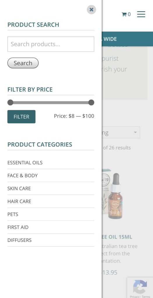
Filters
In line with the search function, the filters help your users to find their way through your ecommerce store faster and more easily. With filters, visitors can refine the products in your online store to match their exact needs. Especially on mobile devices, where only a limited number of items would be visible on the smaller screen, it helps if people can filter out sizes, colours or styles that don’t really interest them.
Form Entry
Another big change – and still one of the number one reasons that conversions fall through on mobile devices- form entries. Entering details on a screen can be time-consuming and frustrating, making a lot of visitors leave the platform before converting. A first tip is to include as few forms as possible. Let people visit your website, browse your products and save items without requiring a sign-up process as a member.
Of course, forms are unavoidable at some points. You can’t sell a product or services without people having to fill out some fields. But even here, there are a few things you can do to make this process as easy as possible.
Choose the simplest input for data: for examples, calendars, dropdowns etc.
Go to the next field when users press Return
Use real-time validation so users won’t have to start over when they filled out something wrong
Use as few fields as possible
Show progress bars in order to motivate them
Usability
Lastly, there are a few things you can do to improve the usability of your mobile website. First of all, make sure to adapt your design to mobile devices. Whether you chose a responsive design or a mobile website, make sure everything is easily accessible and visible on smaller screens.
Even if your images fit within the screen size, you still have to ensure your users can actually see what is on them. Your users should never have to pinch or zoom to see the actual content, so this means you might have to include expandable images or crop images for mobile use.
Another tip we can give you is that you can include guidelines for your users on how to use your website on a mobile device. You can tell them, for example, to view your website in landscape mode to get a better overview of products or a certain page.
Finally, you want your users to stay within your website’s window. Links that open new tabs are confusing on mobile browsers and users often won’t find their way back anymore to your website. Your website visitors will find it easier to swipe back than to switch tabs on a mobile phone.
Mobile Marketing
To conclude, we would like to include a chapter on mobile marketing in this guide as well. It’s not only your website that should be fully optimised for mobile users, but you should incorporate this mobile-first approach into your marketing strategy as well.
Mobile SEO
Like we already mentioned briefly in our introduction, the Google search results only show websites that are optimised for mobile. When you’re working out an SEO strategy, your mobile optimisation has a huge impact. You can use free tools like the Mobile Friendly Test to see how your website is performing.
With mobile search results, your local marketing also becomes increasingly important. Google wants to include results that are in close proximity to the user, so especially when you’re running a business with a physical location, you want your local marketing to be on point.
To improve your SEM marketing even more for mobile devices, we can add certain features AdWords has made available for Search Ads on mobile devices. By adding a call extension, users can immediately call your business – leading to a higher engagement rate.
Other marketing channels
But also on other channels, it’s important to think about the smaller screen sizes. Think about emails, for example, that have to look good on both mobile and desktop screens. Or even just your social media ads, that need to grab the attention of the casual users scrolling through on their smaller screens.
Lastly, think of the extra advantages that mobile can offer. With apps, you can install push notifications, which will get the immediate attention of your users. But also text services like SMS have a very high opening rate and could be ideal to include within your marketing strategy.
If your vet website is not up to date with your services or it simply looks dated then that will reflect on the type of clients you pull in and it will be effecting your Google search results.
There’s a few things we need to take into account with your vet website and what it is actually doing for your practice to benefit from it. Lets go over five important things:
1. A modern website looks like a modern vet practice
Don’t judge a book by it’s cover, yet that is exactly what everyone does! Especially when it comes to choosing a vet practice for our beloved fur babies. This is why your vet website should reflect your practice and the modern facilities it has.
In these modern times, the amount of knowledge consumers now have about businesses comes from what they learn online, before they reach out.
People get a great deal of emotional connection from a website, especially from the pictures they see and the words that are used. If they visit your vet website and see that it looks a little dated, then that reflects on the possibility of the practice being dated.
Once a client has had a visit with you and had a great experience, the likelihood of them staying as permanent client is very high, but they first need to find your vet practice and feel good about visiting – which leads us onto our next point.
2. Rank higher with Google
A modern vet website that has a new updated design and coding, means Google is likely to favour your site because of how it has been structured and how it has been coded. Google loves a highly structured site and one that has been created especially for its Google-bots to scan it.
At Fox & Lee, when we design a veterinary website, we structure it specifically for Google and so that Google rates it higher than a non-structured site.
Our designers are not your standard run-of the mill designers, our designers are User Experience designers, which means we design for humans to use the site easily and we design for Google to rate it highly – all in the one hit. Our designers have this experience and knowledge on how to structure your site so it looks brilliant and ranks very high. This means, as a vet owner, you benefit from the website doing its job once it goes live and not worrying about all the technical things that come along with creating and launching a website.
3. Mobile Friendly
An updated modern vet website is also mobile friendly, which is an absolute must in this day and age! 60% of consumer website browsing is done on a mobile, and (going back to what Google likes), if your vet website is not mobile friendly, then Google will penalise the site and drop it further down the list – giving other mobile friendly websites a higher rank. Plus, it’s annoying for people to visit your site on their mobile and not to have it working properly – this directly relates back to point #1 (a modern website looks like a modern vet practice.
4. Scalable and easy to update
At Fox & Lee, when we create a vet website, we build it with the option to add or scale it to be bigger without a dramatic rise in cost. Because our websites are custom created, it means it’s quite easy for your staff to update it and to scale it up and add services at a later date.
5. Modern functionality
An updated vet website means more modern functionality can be added to it; like online bookings or pet product purchasing and so on. Some of the great add-ons available for vet websites these days (like a booking system) means your website needs to be up-to-date for these functions and add-ons to work in the first.
The take-away on this is that an updated vet website means a better reflection on the type of vet practice you run, much better Google results, a mobile friendly site that people will love to use, you and your staff can easily update it and tweak your services and, more modern functionality can be added (like a booking system).
At Fox & Lee, we build custom designed vet websites that reflect the type of practice you have.
Get in touch with us today – book a free video consultation and we can talk you through it.
If you want your vet website to reflect how fantastic your team is, with the genuine care your vets and nurses provide, along with the brilliant vibe at your practice, then a photoshoot is well worth the investment. There’s nothing like having images of the real people you see at the practice on your website (and on your social media account). People visiting your vet website can then see you and your team and they can see exactly what the vibe of the practice is.
Visiting a vet practice is an emotional visit for humans and for our fur-babies too. But if the humans feel good about it, then our fur-babies feel better about it too. So starting that journey for them with real images of your team culture and what the practice looks like helps put people at ease. Plus, people love it! They get a kick out of seeing the real vet clinic and where they are about to go.
It’s a chance for you to visually show how good the vet practice is and what sort of products and facilities you have available. People love seeing this type of thing and it helps them connect with a provider that could possibly be in their lives for the life of their pet.
If your vet practice works with some unorthodox pets, then showing a few images of yourself and your staff with that snake, lizard, ferret or turtle is a huge thrill for pet owners alike. Especially when they see that their beloved pet can now be looked after by a vet close by.
The images can also be used on your vet social media platform. This is one of the best ways to keep in touch with your customers and share images of your clients visits and your team doing what they do best.
At Fox & Lee, we organise photoshoots for quite a lot of our website clients and it always turns out brilliantly. The experience of the photographer being there and capturing everyone together and working away is an event that everyone loves and feel great about.
What’s the takeaway here; If you want to capture the true spirit of your vet practice and you don’t want to use stock images, then a photoshoot is definitely worth the investment. The benefits of your own personal imagery being shown on your vet website and social media account completely transforms the message being sent and how your practice is conceived.
At Fox & Lee, we build custom designed vet websites that reflect the type of practice you have and organise professional photography to be done. Even if you have a website and just want a few updates done, we can help out. Get in touch with us today – book a free video consultation and we can talk you through it.
If your vet practice offers a few unorthodox or unique services or you work with exotic animals, reptiles and other unusual pets then your potential client base could double with a Google Adwords campaign targeted directly at those pet owners.
Even if you are thinking about adding an extra service, but not sure how to drive awareness to the fact that you now have this service, then getting the word out via a Google Adwords campaign is great way to spread the word fast – with a high return on results. This is because of the highly targeted system that Google uses to reach that exact audience.
Pet owners of unusual pets can find it hard to connect with a vet that works on their particular animal, sometimes resulting in a long day-trip to get to the nearest practice. If this is an area that you would like to tap into and bring more of these clients into your vet practice, then we can help you with an Adwords campaign to educate and build awareness with these people and target audience.
The same goes for any new (or existing) services you offer, that might need a little extra awareness to gain traction. For example:
Dog Bath
Pet Grooming
X-Rays
Specialised blood work
Reptile Vet on particular days
Surgery
Elderly pet care
Puppy pre-school
Behaviour Management
Dog Training
Mobile Vet Services
Emergency Services
It doesn’t matter what the service is – if it needs a little push to help promote it and gain more customers needing the service then we can help.
At Fox & Lee, we build custom designed vet websites that reflect the type of practice you have and run Google Adword Campaigns to promote services that you offer. Even you have a website and just want a few updates done, and to promote a new service – we can help out. Get in touch with us today – book a free video consultation and we can talk you through it.
To put it simply, if your website is slow, you’re losing sales! The more competitive the space, the more revenue you are giving away to the competition. When it comes to online shopping, customers on average, will only spend around a total of 6 minutes on your site.
What you don’t want to happen During that 6 minute window of opportunity, they spend their time becoming frustrated and annoyed with your website trying to find what they need, till they reach the point where they abandon the site and search for a faster and better shopping experience with one of your competitors, never to return again.
What you do want to happen Your website loads fast, and that fast page load speed continues throughout your customers shopping spree as they navigate through your website right through to purchase.
Important Point – A fast website not only contributes to a much higher conversion rate on the customer’s first visit, but is also a massive contributing factor to your customers returning within the next 3-6 months to purchase again.
Scoring a Positive Review When it comes to eCommerce, everything you do should contribute to creating a raving fan and securing a positive review for your store or product. It’s a fact that people are much more likely to leave a bad review when something goes wrong than they are when something goes right. Everybody hates a slow website, so if you want to increase the chances of scoring a great customer review, you better make sure your website is fast.
So, how do you speed up your website? Now there are plenty of posts across the internet on the topic of Website Speed Optimisation, so our aim in this resource is to highlight and prioritise the easiest things that you can do, with a focus on websites built using WordPress and WooCommerce.
1. Your product images are too big. Oversized images are the most common cause of slow loading websites, so sign up for an image optimisation service like Shortpixel. Install their plugin, configure and start optimising the images in your media gallery. But, don’t become too obsessed with image optimisation; you want to find the happy balance between an image that still looks nice and sharp but has a compact file size for faster delivery. Great looking images contribute to a higher conversion rate; blurry, pixilated images do not.
Important Tip –I would suggest generating WEP and AVI versions of your images, which Shortpixil facilitates. WEP and AVI are new types of image formats that will allow you to reduce your image file size to be smaller than that of a JPEG or PNG while still maintaining the quality of the image. Both Chrome and Safari support these modern image formats, which are by far the most common browsers people are using.
2. You are on cheap hosting! If you have an eCommerce website, you need quality website hosting. Unfortunately, most big-name hosting companies are more interested in squeezing as many websites as possible into a shared hosting environment to make as much money as possible. For eCommerce hosting, you should either be on a dedicated server if you have steady, predictable traffic. Or, if you need the flexibility of scaling up quickly to account for a sudden increase in traffic, Cloud hosting is the right choice for you.A sudden increase in traffic can be caused by one of your products going viral or during a peak buying season like Black Friday, Cyber Monday pre- Christmas etc. With cloud hosting, you can quickly allocate more server resources to handle the increased traffic via a quick phone call to your hosting company.
Important Tip –If you are an Australian based company and need a fast response from your hosting provider, I suggest speaking to the guys at Servers Australia. Their support team is Australian based; they offer 24/7 support and provide various Cloud and dedicated hosting solutions.
3. You’re using an Off the Shelf multiple purpose eCommerce Theme. If your website was built by an agency that does not specialise in eCommerce, or you built it yourself. Most likely, the website has been built using a multi-purpose eCommerce theme that comes with all the bells and whistles. The problem with this type of theme is that it has been created to appeal to as wide an audience as possible to maximise sales. The result of this (from a coding perspective) is a bloated mess that is extremely hard to optimise and maintain long term; when it comes to performance – less is more. Think of your website as a high-performance race car, every gram of unnecessary weight has been stripped away, leaving just the lightweight parts that are engineered to work together to win the race.You may love the look and feel of your website, so the solution may be that you just need to reach out to an eCommerce Developer to strip down your website and rebuild it without all the extra unnecessary weight slowing it down.
4. Too Many Plugins Installed! Now, let me firstly state, there is nothing wrong with installing wisely chosen, well-coded plugins to introduce the feature or functionality into your site needed to give it the edge over the competition. But, if you have gone ahead and installed a bunch of plugins, each coded by different developers, each doing a separate task, your website speed and reliability will suffer. If you are reading this resourceful information, you are most likely not a website developer and cannot possibly tell a quality plugin from a bad one. But what you can do is complete a simple plugin audit yourself. Login to the backend of your website, review all the plugins that have been installed and deactivate the ones that are not needed. Then check the site’s functionality is not affected and delete the deactivated plugins. By deleting the unnecessary plugins, 90% of the time, you will have contributed to speeding up your website.
Important Tip –If you find a lot of outdated plugins, either update them or remove them, as outdated plugins pose a significant security risk to your website, making your site more vulnerable to hackers.
5. Use a Content Delivery Network (CDN) By incorporating a CDN, you can significantly reduce your website load time, especially if it is image-heavy like an eCommerce website. In simple terms, the benefit of a CDN is that it will load your website content from the nearest data centre to your customer. So, for example, if you are an Australian based company selling in the USA and a customer from California is shopping on your website, you would want the website loading fast from the nearest data centre in the USA, not from Sydney, Australia.
Important Tip –Choose your CDN wisely, make sure it has data centres in the countries you are targeting and make sure it is a paid service. There are risks with using a free CDNs service, as some countries have internet providers that block free CDNs as it loses them revenue. The two largest Telecommunication companies in Australia are guilty of this, forcing websites to load from overseas data centres without you knowing. But if you are paying for the CDN service, that means the telcos are getting a payment passed on, and your website is much more likely to load from the location-specific data centres as expected.
In conclusion The five points listed above are items you can largely do yourself. However, beyond this point, further optimisation becomes a highly technical and specialised skill, where you need an experienced developer with solid experience optimising websites, which is where we excel.
If you would like to discuss further how we can assist you in speeding up your website, please feel free to book in a call to discuss further.
eCommerce changes every day. With the user experience improving and technology offering us new advantages at a rapid rate, customers will demand an optimised ecommerce experience from your website. Want to make sure you’re ahead of the game and have these things on your site? Read on – we’ve listed a few trends that have been around for years and are here to stay into the late 2020’s.
Find out what the biggest trends for ecommerce websites are and ensure you don’t miss out on potential customers.
Ai & Chatbot “How Can I Help?”
Get ready for the invasion of robots into ecommerce online stores. Infact – chatbots are already here and being widely used on more ecommerce sites than you might think. Chatbots and Ai functionalities will take over tasks from humans and improve the user experience in your online store. Live chat can be started by Ai and help customers by recognising keywords in their conversation and providing options that fit the keyword criteria. When the bot can no longer answer the question, the customer is discretely maneuvered to a human live chat manned by your staff. This is great for customer service and retaining the user on your site and excellent for freeing up staff resources. Time to invest in a bespoke functionality to enhance your online customer service.
Product Visualisation
People have gotten used to online shopping, but nothing beats the feeling of actually holding the product. Augmented reality and 3D are coming pretty close in offering customers that sensation, but that’s a little more into the future yet. HERE’S A PRO TIP: Implement video content to give users a better idea of what your product looks like. People like to see other people and if they can see your product in the hands of another human then half the sale is done. Video will give users an idea of real size, colour, texture and quality. Back your video up with some great images and you’ll find users are more like to “add to cart”.
Voice Search “Alexa” “Siri”
Voice search is growing rapidly, and your ecommerce store needs to adapt to this. Since more and more purchases are made through Alexa or Google Home, ecommerce businesses should focus on long-tail keywords to capture this audience. Sound a bit confusing? Get in touch with us, we specialise in ecommerce website and we can help with this.
Personalisation “Related Products”
Take your related product to the next level, and show products your users are actually interested in. With tools available for deep personalisation, it becomes easier than ever to show the right message to the right people.
Payment Process
One of the biggest killers of an online purchase is an old and sluggish payment process. If you have an outdated, old or lengthy checkout process on your ecommerce site then it’s time to upgrade asap! The checkout processes has become so simplified with web payment services such as Apple Pay or Google Pay, customers can purchase items with a simply click. Say goodbye to lengthy forms for customers to fill out and an array of confusing options to choose from – quick, easy and seamless is the way to go and this is one trend that is not going away.
Ethical eCommerce
Consumers are getting more aware of their carbon footprint and the impact ecommerce has on the earth. In order to win over the users’ consciousness, you have to strive for total transparency.
Where were the items made?
How far do they have to get shipped?
What box does it come in?
How sustainable is it?
Other Sales Platforms #sellyourstuff
Your website is not the only platform driving you sales anymore. Social media channels are playing a bigger roles in generating sales, meaning ecommerce businesses should get more experimental with different ways of social media. With in-app purchases, Google shopping and market-place avenues, the platforms are endless in which you make a sale.
We specialise in ecommerce website design and development and all things that go hand-in-hand like ecommerce SEO. If you need to ramp up your ecommerce store and catch up to what your competitors are doing then get in touch with us – we can help.
We had a fantastic experience working with Fox & Lee to build our marketplace platform and mobile app (MVP) for Unwrapp. From day one, Matt and Ava were an absolute pleasure to work with.During the initial requirements and discovery phase, they went above and beyond by offering valuable suggestions, practical advice, and thoughtful challenges that helped shape the product in the right direction. They didn’t just take requirements at face value - they genuinely took the time to understand our startup, our vision, and our constraints as an early-stage business.The end result is a beautifully built marketplace platform and mobile app that we’re incredibly proud of. The attention to detail, design quality, and overall execution exceeded our expectations.What truly sets Fox & Lee apart is their collaborative approach, clear communication, and genuine care for their clients’ success. We felt supported throughout the journey, not just as customers but as partners.We highly recommend Fox & Lee to any startup or business looking for a reliable, thoughtful, and talented development team.
I recently engaged Fox & Lee to update my website and create a new logo. Could not be more happy with the end result and they made the process easy. Would highly recommend.
We couldn't be happier with the results from Ava and the entire team at Fox and Lee.Ava was friendly, approachable, and maintained excellent communication throughout the entire project. This made the complex task of building a new website for our construction company seamless.Beyond the website, they provided invaluable assistance with our branding and design. We consistently receive positive feedback from customers and partners on our logo, branding and website design.We are genuinely thrilled with the outcome and the quality of their work.If you are looking for a new or updated website or need branding expertise, we will absolutely be recommending Fox and Lee. Thank you, Ava and team!
The team at Fox and Lee are so professional and friendly. All aspects of my site are looked after by them. I am a small business owner that relies heavily on them for all my website needs, issues or changes. They are prompt to respond, and any changes or fixes are done immediately. They are more than 5 stars.Thank you for your fantastic service guys, couldn't recommend a greater team.
Very helpful and very quick to reply and sort problems out. Highly recommend this company as you can actually talk on the phone to the help desk. Definately 5 star
Our business, CiGen, has been using Fox & Lee for a couple of years now and they have been nothing short of amazing!From assisting us to design and redevelop our website, ensuring that the website is running smoothly, and being very proactive and helpful when the occasional issue arises.We would highly recommend Fox & Lee for website design and services.
Matt and the entire Fox & Lee team are amazing. The team is easy to speak with and always jumping to help. Customer service is a major part of our business and it’s refreshing to see this team offer us the same each and every time, going above and beyond to help.The team has been an integral part of Coffeeteca since the beginning. Their attention to detail and can do attitude has tremendously helped our business grow into what it has become today.Fox & Lee’s web support has been second to none and they also take care of our all our digital marketing. The team are committed to delivering great results month on month and always determined to find new and innovative ways to improve our reach, presence and ultimately, our business.We can’t thank Matt and the team enough and highly recommend their services to anyone looking to better manage their business online.
Fox & Lee truly excelled in their work. Our previous website was sluggish, disorganized, and failing to generate any business. They reconstructed it entirely, and within a few months, we began to receive genuine inquiries. I only wish we had discovered them sooner.
What I appreciated most about Fox & Lee was how clearly they explained everything. I never felt overwhelmed or out of my depth they made sure I understood the options so I could make the right decisions about my website and digital marketing strategy. And those decisions are paying off big time for my business.
We’d had a bad experience with another agency that disappeared halfway through the job. Fox & Lee stepped in, sorted out the mess, and gave us a site we’re proud of. They actually care about the outcome huge difference.
We used Fox & Lee for a complete redesign and SEO overhaul. It’s been a game changer for our brand presence and getting leads. Support has been ongoing and really quick.
I just needed something that worked. Fox & Lee delivered a site that looks professional and is easy to update. They even sorted our Google profile. We’ve had more calls in the last month than we used to get in a quarter.
Incredible experience with Matt and the Fox & Lee team. They took the time to understand our business and delivered a site that speaks to our ideal clients. SEO results have been solid we’re finally seeing consistent traffic and inquiries.
Matt and the team helped us turn our outdated site into a modern WordPress site. Leads have more than doubled since the redesign and our customers love how easy it is to use.
Their SEO work had us ranking on page one within months. We’re getting consistent local inquiries now from all around Melbourne well worth the investment.
Fox & Lee helped us turn our outdated site into a modern WordPress powerhouse. Leads have more than doubled since the redesign and our customers love how easy it is to use. Highly recommend Fox & Lee!
Fox & Lee revamped our online store and implemented Google Ads and SEO strategies. Within 6 weeks we saw a 40% uplift in traffic and a strong boost in sales. Couldn’t ask for better.
We’ve worked with a few agencies, but Fox & Lee stands out. Honest advice, measurable results, and excellent support. Our Google Ads campaign went from break-even to profitable in 3 months.
Fox & Lee were brilliant to deal with, especially after the nightmare we had with our previous agency. They've built us an excellent new website and local search optimisation that is bringing us new leads everyday. We're so glad we found you!
Thanks to the team at Fox & Lee for our great website project! We were looking for a Melbourne Web Design agency and they took the time to understand our requirements and gave us a great solution on time and on budget. They were professional and friendly with great communication. Highly recommended for any business wanting to build their presence online.
If you're looking for a high quality, ethical and professional Web Design studio based locally in Melbourne - l strongly suggest you contact David and his team at Fox & Lee! The professionalism and efficiency on display with every interaction l have had with them has been incredible! And the advice and guidance they provide is 2nd to none! I look forward to returning soon when new opportunities to explore and develop present!!
David and the team have been fantastic to work with. They are professional, experts in their field and really understood what we wanted to achieve with our rebrand/website re-design. We loved the results and have received great feedback from our clients. We would highly recommend their services!
Dave and the team at Fox & Lee are the best web developers we've ever worked with, they made it so easy, were very open and transparent, knew exactly what they were doing, and produced a fantastic website for us!
Working with David and the team at Fox and Lee has been a fantastic experience. The professionalism and skill level they’ve displayed when building our website has exceeded expectations. Fox and Lee took the time to understand our business and build a website that reflects us perfectly. We’re very happy we choose Fox and Lee as our web agency and highly recommended them to anyone needing a new website.
Great ability to listen to your business needs - very competent in CS Cart Multi-vendor with a good understanding of the platform and the latest developments. Very strongly engaged and super responsive. Would definitely recommend.
David and his team are exceptional at what they do and go above and beyond for their clients. I couldn't recommend them enough for anyone looking for a new website.
Fox & Lee are very professional and were fantastic at creating a website for our company. They took their time getting to know our company and creating a profile of our needs. Fox & Lee were with us every step of the way and guided us to make the best decisions for our company. Would highly recommend Fox & Lee to design a website for you or your company.
I couldn't rate Fox & Lee highly enough! Exceptional customer service from the get go and nothing was ever a problem. I love our 2 new websites and our customers feedback so far is excellent and sales are growing !! Thanks Team for your support
Absolutely loved working with these guys! I've been a Production Manager at Advertising agencies for year - we brought Fox & Lee on for a rebrand and digital design/build. Their results were clean, fresh and thoughtful design implemented with user friendly digital flow. Communication was always clear and they always added value in their design thought. Amazing value for the end product and ease of working together!
Fantastic service !!! They have built my online store from scratch and everything I have requested they have done without any complications. Very understanding and a breeze to work with.
Fox and Lee have been absolutely delightful to work with. They were professional, creative, knowledgeable and always had our best interest at heart. Very happy with our website and would highly recommended them.Danni | Wag & Me | Owner
Fantastic company. They take the time to understand us and the direction we are heading with our business. They are leading the way with concept design and branding. Best decision we ever made was engaging their services.
Send us a message
Fill out the below form and we’ll be in touch with you


")


