The Complete SEO Guide: Mastering Search Engine Optimisation
Search engine optimisation is changing fast in 2026. Fox & Lee’s complete guide covers everything from Core Web Vitals and keyword strategy to AI Overviews to help businesses rank higher.
The ecommerce industry is incredibly competitive, but we probably don’t have to tell you that. With more than half of start-ups failing these days, you need to have your strategy on point. We know it’s not as easy as it sounds, but a strong online store is a good start. There’s a lot involved with […]

The ecommerce industry is incredibly competitive, but we probably don’t have to tell you that. With more than half of start-ups failing these days, you need to have your strategy on point. We know it’s not as easy as it sounds, but a strong online store is a good start.
There’s a lot involved with setting up your online store, which also means that there is a lot of room for mistakes. Well, we listed some of those most common mistakes found in ecommerce stores today. They’re often easy to avoid but could have a huge impact on your conversion rate when corrected. Let’s have a look at how you can grow your sales by avoiding these 13 mistakes in your ecommerce online store.
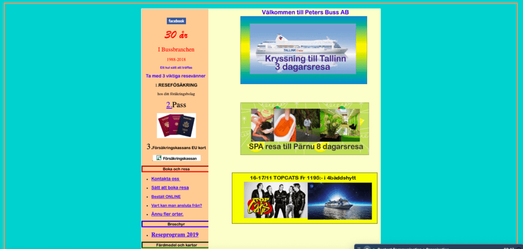
When users get to your website, you want them to easily find their way around. The lack of clear navigation will leave your users lost and confused, and will thus decrease the chances of them actually buying your products.
By installing a clear menu with your main categories and subcategories, users will know where to go and will be able to shop around easily. Another tip is to follow common design practices when implementing navigation. Although it might be tempting to show your creative side, implementing non-standard navigations will often have a negative effect.

Source: Neil Patel
In line with clear navigational elements are breadcrumbs. Breadcrumbs show users exactly where they are on your website, showing the category and subcategories of the products they’re viewing. By showing this hierarchy, you reduce clutter and it’s easier for customers to backtrack.
Woolworths shows navigational breadcrumbs so you know what category and subcategory you’re viewing
Breadcrumbs don’t need a fancy design. Just the name of the category groups, separated by arrows or dashes, will do. It is, however, necessary that they link back to the right pages – otherwise, it can function as a useful navigational element.
Don’t underestimate the power of visuals. You might be selling the best goods you can think of for the lowest prices imaginable – if your design looks crappy, you won’t make as many sales. People love things that are aesthetically pleasing and your ecommerce store is no exception.
Designing your ecommerce store is something you definitely shouldn’t do alone – unless you’re an experienced web designer – since you want an online store that has a modern look and feels while also offering the users a pleasant experience. We recommended hiring a web designer with extensive knowledge in ecommerce web design, so you know the design will be conversion-optimised.
Although we could write a whole guide on SEO (as a matter of fact, we did – and you can find it here), there are a couple of SEO aspects that shouldn’t be overlooked when it comes to ecommerce.
First of all, make sure there are no broken links on your website. Your online store will probably consist out of a lot more pages than your average website, so you need to ensure all of these still function well. You can use a tool like Screaming Frog to help you out.
Secondly, all the links that do work should be findable by the bots that crawl your website. This means there should be links going from your homepage to every single page of your website.
Lastly, you should optimise all the different tags on your landing pages. This includes the alt-tags for your product images, your heading tags and page titles, so the search engines can rank your product pages accordingly.
While we’re on the topic of SEO, we’d like to point out the product descriptions. These could have a huge impact on your rankings in the search results.
A lot of ecommerce stores simply just copy paste the product descriptions they get from their manufacturer or supplier. By doing this, you’re just implementing duplicate content onto your website – a big no-go for the Google Bots.
Try to write your own product descriptions and, more importantly, keep your target audience in mind. With manually written product descriptions, it’s easier to write about exactly those features that will convince your target audience. It also gives you the opportunity to really stand out from your competitor.
This should be a no-brainer, but we like to include it just in case. People shop on-the-go which means your website should work just as fine on a tablet or mobile as it does on a desktop.
There are still a lot of ecommerce stores out there that start building their online store on a desktop, without keeping their mobile version in mind. Afterwards, they create a responsive version or a mobile website, meaning they have to try to fit all these elements into a smaller screen.
Best is to have two approaches. One platform for desktop-shoppers, and one for a screen that fits in your hand. It’s up to you what works best: a responsive website, a mobile website or a dedicated app – but if you need some advice, a responsive web designer will be able to help you out.
It’s not only the design of your online store that should focus on mobile users but also the user experience of your shop. People that shop on smaller screens use the search function a lot more, find it often harder to navigate around your mobile shop, don’t want to fill out as many forms when creating a profile and prefer an easy check-out process. Make sure you optimise your user experience for both desktop and mobile users.
We already mentioned it, but we’ll go into more detail now about the search function of your website. As we said, it’s mostly used by people on mobile – since menus are often hidden or just harder to navigate with a thumb – but also people on desktop or other devices use it to quickly find what they’re looking for.
First of all, we would like to point out that people who use this function are more likely to convert. Why? Because they know what they’re looking for. They aren’t just shopping around but are looking for a specific product. Which obviously means they’re further in the buying cycle.
So what if they look for a product and it doesn’t show up in your search results? Well, they will leave your website and go to your competitor. When you don’t have the product, this might seem unavoidable, but maybe you can show related products (in a different colour for example) that the searcher might be interested in as well.
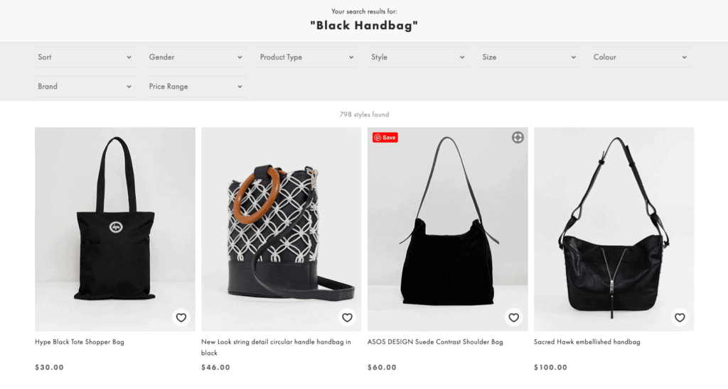
Another reason your site search doesn’t show any results might be because the user didn’t use the exact keywords that match the product name or description. Let’s say your potential customer searches for ‘black bag for women’ but your products don’t show up because they’re named ‘black women handbag’.

Asos shows all types of black bags when searching for handbags
We know it can be a long and complex process to get your search function working well, but again, think about the likelihood of these people converting. Hire an ecommerce web developer, who can ensure your search function drives you more sales.
Another very common mistake that ecommerce stores make is the lack of a clear brand story. We’re not saying you need to have a whole story written out on your website somewhere (although we do recommend including this on your About Us page), but you at least need to have a clear idea of what your brand stands for.
This includes your mission, vision and what you value. Why do you sell these items? Who are you trying to reach? How is this reflected in the products you offer and the branding you use on a website?
Obviously, this brand story should also be represented in your logo, brand colours and the images that you use on the website. Make sure you keep your brand consistent (both on your website and on social media) so your customers get a seamless brand experience across all marketing channels.
Do you remember the days without internet? You would go to a certain bakery because your neighbour had told you their bread was yummy. You would pick a hairdresser because your auntie’s hair looked fabulous last week. It was all about word-of-mouth referrals, where you would trust the opinion or experience of somebody else.
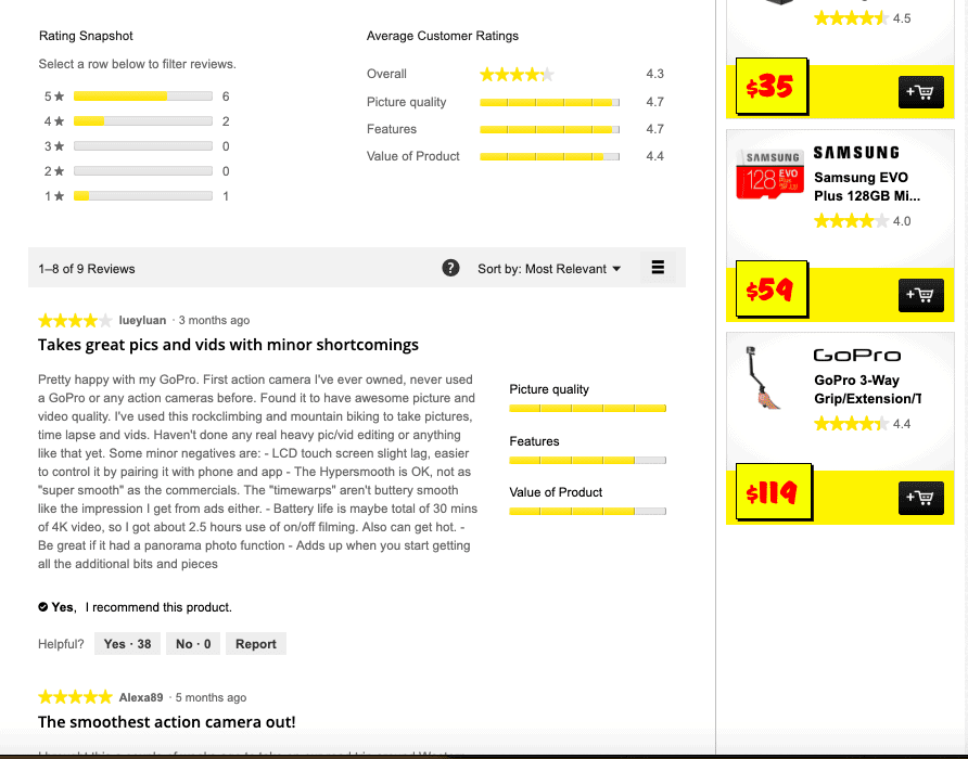
It’s no different these days – we still trust referrals more than anything, although they changed into an online version. Reviews, ratings and testimonials became extremely important and will make the difference between a sale or not.
Reviews are needed for the products you offer to convince the customer of its quality and benefits. However, you also need reviews for your company or online store itself – so people know you can be trusted when it comes to payment and shipping procedures.
Reviews can be collected on your website (which we would recommend for product reviews), on social media or on Google. Try to get a few on each, since people have different preferences when it comes to checking reviews. There might be a website in your industry that collects reviews and ratings of different shops too.

Reviews of the GoPro Hero7 on JB Hifi
This mistake should be avoided at all costs since there is nothing worse than your sale slipping through the cracks last-minute. Your customer already decided they want to purchase your product, but due to a complex or inconvenient check-out process, they abandon their shopping cart or click away right before the payment.
Bad check-out experiences can happen for various reasons. Asking more details than needed is often a big one, just like too many steps or forms to fill out. The lack of certain payment methods is another reason customers could exit at the last minute. And lastly, unexpected costs that are added last minute could really hurt your sale rate (and brand image).
When we talk about the site structure, we mean both the way you organised your pages and the way you categorised your products. It all starts with dividing the products you offer into meaningful product categories.
By choosing the right categories for your products, your customers will have an easier job finding what they’re looking for. You want to create categories that aren’t too broad, but you also have to watch out with going too specific since you want to show at least a few products for every category.
Once you’ve decided on this, you have to create separate category pages for every product group. Don’t forget to include filters, so your visitors can adjust their preferences and quickly browse through the items that they’re interested in.
We know you might have a lot to say. You want to start a summer sale. You’ve decided to offer Free Shipping for 2 months. You have a newsletter you want to share. And visitors can play a game for a discount code. That’s great – the more incentives the better. But please, don’t put them all in a different pop-up screen.
People don’t like pop-ups. They interrupt with what they’re doing. They often don’t even read them before clicking away. Sure, it’s a good practice if you have something really exciting to say. Like an extra discount that can be applied immediately. But try to stick to a minimum when it comes to announcements popping up all over your online store.
And lastly, we want to point out the importance of a good CMS. Don’t try to reinvent the wheel. There are so many good ecommerce platforms available these days, that it would be crazy to try to replicate these.
We know you might need a custom solution that works exactly right for your business. The available platforms are, however, highly customisable when in hands of experienced developers. We would recommend letting one of these guys do their magic, so you can work with a platform that suits well.
Whatever platform you decide to chose depends on your personal preference. We are huge WooCommerce-fans and love its functionality and design options. Talk to an ecommerce web developer (yep, that’s us) to find out more about what WooCommerce can do for your business.

Search engine optimisation is changing fast in 2026. Fox & Lee’s complete guide covers everything from Core Web Vitals and keyword strategy to AI Overviews to help businesses rank higher.

Compare top WordPress Care Plan providers in Melbourne. See Prices, Inclusions, Experience and Customer Reviews.

What Australian businesses need to know about WordPress in 2026 — from Full Site Editing and real-time collaboration to smarter WooCommerce and tighter security.
© Fox & Lee Holdings Pty Ltd 2026