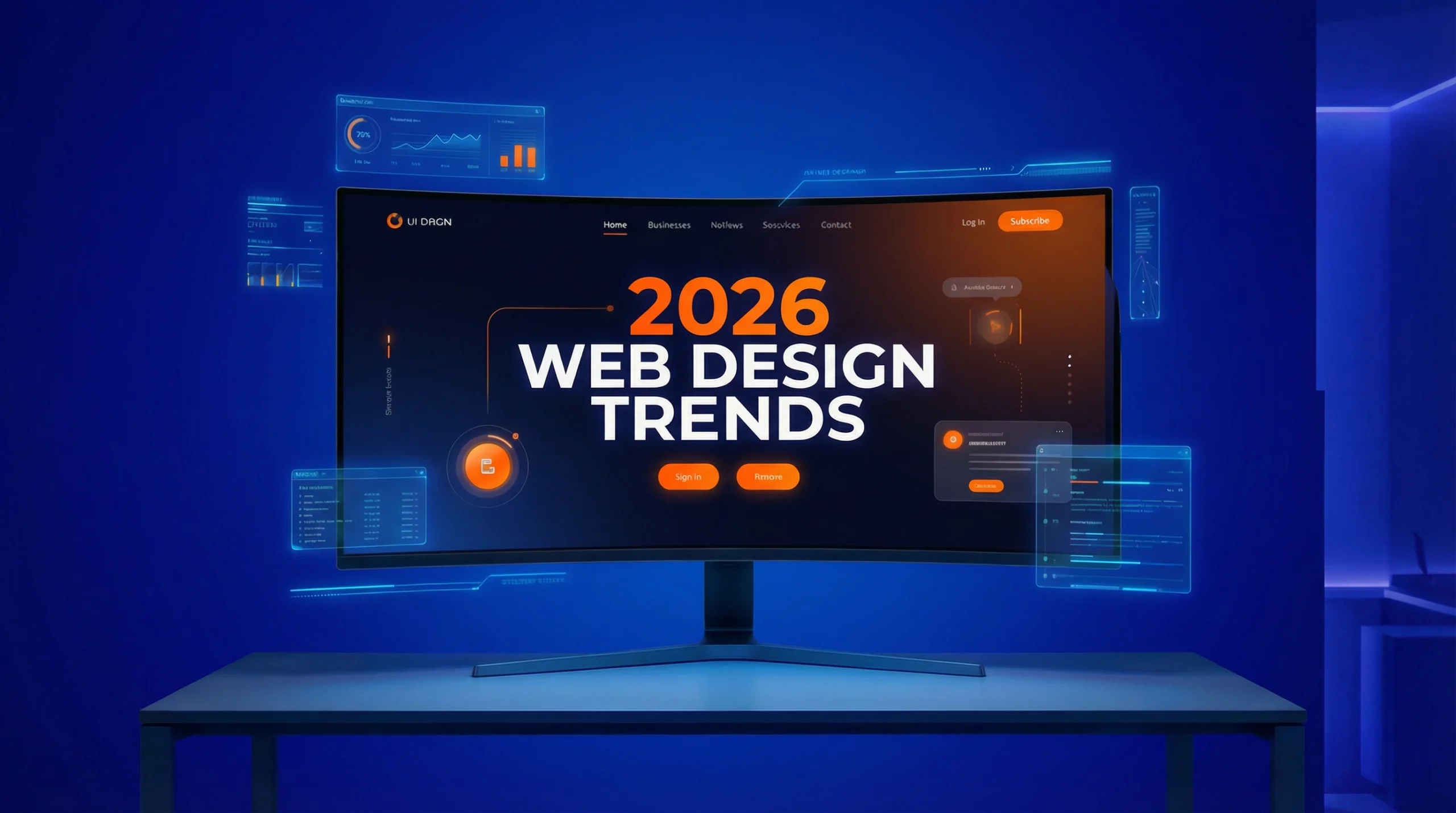
The Complete SEO Guide: Mastering Search Engine Optimisation
Search engine optimisation is changing fast in 2026. Fox & Lee’s complete guide covers everything from Core Web Vitals and keyword strategy to AI Overviews to help businesses rank higher.
Discover how AI and human-centric design are redefining user trust in 2026.
There is digital noise and AI-generated content everywhere, making ‘trust’ the most valuable aspect of winning customers online.
For Australian businesses, particularly in sectors like finance, health, and legal services, building and maintaining trust is paramount.
The most successful websites will be those that integrate new innovations within established UX frameworks. Users shouldn’t have to relearn how to navigate a website every time they visit a new one.
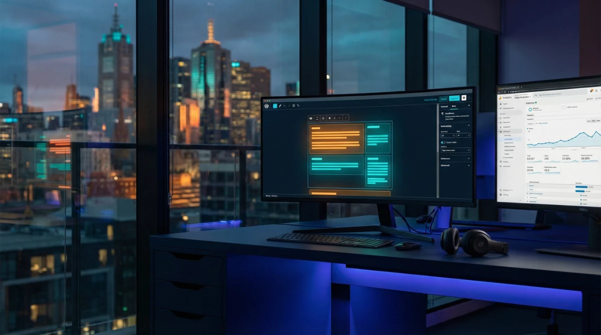
AI is reshaping web design. It is evolving from a content generator into a “creative co-designer.”
Forget generic stock photos. In 2026, AI-powered image generation tools allow businesses to create unique, high-quality, and on-brand visuals that resonate with their target audience.
From detailed, stylised illustrations to hyper-realistic product visualisations.
The Ezy Systems website, built by Fox & Lee — using existing website imagery recreated with AI to produce high-quality, on-brand visuals across desktop and mobile.

The era of “browsing” is over.
In 2026, your customers are hunting for information, and they are doing it on screens smaller than a postcard.
With mobile devices now accounting for over 63% of all global web traffic, the margin for error has vanished. If a user cannot find what they need—a phone number, a 'Book Now' button, or a service list—within three seconds, they will bounce to a competitor.
Key things to beware of:

Dark mode has been growing in popularity for several years, and in 2026, it may become the default for many websites.
Dark mode can offer a more sleek, modern aesthetic and help reduce eye strain, making it more user-friendly than white screen counterparts. It also has practical benefits, such as conserving battery life on mobile devices with OLED screens.
But hard switching a website or brand can be disorientating, so there is a trend to include switching between light and dark based on user preferences or system settings (making it a personalised decision).
A well-designed dark mode uses carefully chosen colour schemes that reduce eye strain, improve readability, and maintain brand consistency. If it's a switch, it should also be seamless or sync with their device settings.

“Scrollytelling” is emerging as a powerful way to engage users and tell a compelling brand story.
This trend uses a combination of animation, video, and interactive elements to create a narrative that unfolds as the user scrolls down the page.

However, it’s not for everyone and needs to be used delicately. The key to effective scrollytelling is balance. The animations and interactions should enhance the story, not distract from it.
Scrollytelling is most effective for long form content, that is better broken up - allowing you to guide the user through a journey and create a memorable, immersive experience.
Some examples might be:
Every element should serve a purpose, and the overall experience should feel smooth and natural, not forced or gimmicky.
Micro-interactions are the small, subtle animations and feedback mechanisms that make a website feel alive and responsive.
A button that changes colour when you hover over it, a form field that shakes when you enter incorrect information, or a loading animation that makes wait times feel shorter—these are all examples of micro-interactions.
In 2026, micro-interactions are becoming more sophisticated and purposeful. They’re about improving usability and reducing the thinking required of website visitors.
Well-designed micro-interactions guide users through complex processes, confirm actions, and make the overall experience more intuitive and enjoyable. The key is to keep them lightweight and accessible, with options to reduce motion for users with vestibular disorders.

In 2026, AI is no longer just a buzzword; it’s a practical toolkit for creating smarter, more personalised, and highly efficient user experiences.
This trend moves beyond basic chatbots to integrate AI into the very fabric of your website, making it more responsive to individual user needs.
For content-heavy websites, such as blogs, news portals, or resource hubs, AI can provide concise summaries of long articles. This feature is a game-changer for time-poor users who want to quickly grasp the key takeaways before committing to a full read.

With the rise of smart speakers and voice assistants, optimising your website for voice search is no longer optional. This involves structuring your content to directly answer the kinds of questions users ask aloud.
Think in terms of natural language and conversational queries. For example, instead of targeting the keyword “best plumber Sydney,” you would optimise for a question like, “Who is the best plumber near me in Sydney?”
This requires a deep understanding of user intent and a content strategy that prioritises clear, concise, and direct answers.
Websites are becoming chameleons, able to dynamically adjust content, layouts, and recommendations based on a user’s browsing history, location, and on-site behaviour. This creates a more relevant and engaging experience for every visitor.
For an e-commerce site, this could mean showcasing products based on past purchases. For a B2B service provider, it might involve highlighting case studies from the visitor’s industry.
This level of personalisation makes users feel understood and valued, fostering a stronger connection with your brand.
Search engine optimisation is changing fast in 2026. Fox & Lee’s complete guide covers everything from Core Web Vitals and keyword strategy to AI Overviews to help businesses rank higher.

Compare top WordPress Care Plan providers in Melbourne. See Prices, Inclusions, Experience and Customer Reviews.
What Australian businesses need to know about WordPress in 2026 — from Full Site Editing and real-time collaboration to smarter WooCommerce and tighter security.

© Fox & Lee Holdings Pty Ltd 2026