The Complete SEO Guide: Mastering Search Engine Optimisation
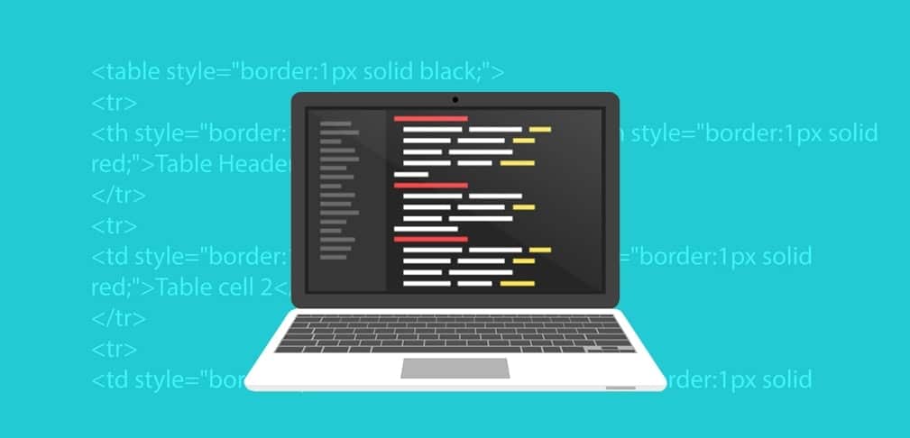
Search engine optimisation is changing fast in 2026. Fox & Lee’s complete guide covers everything from Core Web Vitals and keyword strategy to AI Overviews to help businesses rank higher.
Web design changed a lot over the last couple of years. Where designers originally only had to think about a couple of different screen sizes, they now have to consider all devices ranging from smartphones to big desktops. The rise of small screen sizes had a big impact on web design and web development for […]

Web design changed a lot over the last couple of years. Where designers originally only had to think about a couple of different screen sizes, they now have to consider all devices ranging from smartphones to big desktops.
The rise of small screen sizes had a big impact on web design and web development for both traditional and ecommerce websites. Not only did designers all of the sudden have to fit all the information and images into a smaller visible surface, but they also had to rethink UX principles. A thumb works differently than a mouse, a menu takes up to much space and scrolling too far down might make people leave the page early.
A whole new way of designing websites is a result of our shift to mobile. And with more than 60% of global website traffic being on mobile, mobile websites have become the norm nowadays. Your visitors won’t spend a minute on a website that doesn’t fit into their screen, and Google won’t even show your site in their search result if it doesn’t work properly on different devices.
So let this be clear: your website should be adapted to a mobile device in 2024. Even more, your website should be created for a mobile device. How? Well, we can walk you through the basics. There’s quite a bit of coding knowledge required to develop your customised website for every screen (no worries – we got you), but we’re happy to explain to you how the basics work.
To design a website that works perfectly well on a mobile device there are a couple of different options. You can either create a responsive design, implement a dedicated mobile website or develop a mobile app.
If you have been looking around a little bit for your custom website, you might have come across a couple of different terms already when it comes to mobile web design. You can work with a responsive design, you can create a complete mobile website or you can develop an app that fits with your company.
Let’s have a look at what the differences are between these three options.
If you use a responsive design, you use a website design that works equally well on desktop, tablet or mobile devices with the same content. The site can be viewed on all the different screen sizes, but the layout automatically gets adjusted.
This means that the website should be perfectly visible on your mobile phone, without any zooming, pinching or scrolling involved. The elements of your desktop version will automatically be re-arranged so everything fits within the size of the screen.
Your responsive website also changes its layout when you change the size of your browser screen for example. By re-stacking the elements, everything will fit into the screen without it costing any effort for the user.

When the screen becomes smaller, the elements on the page reorganise so everything fits
A mobile website, on the other hand, is a website that is specifically designed for a mobile device. It’s a completely different website than your main website and is usually housed under its own URL, for example, m.mywebsite.com. Whenever the user wants to visit your website from a mobile device, they will be redirected to this dedicated mobile site.
By creating a completely separate platform for mobile users, you can carefully choose which items and elements you want to display. You can limit the amount of content visible on smaller screen sizes, so the user experience won’t get distracted by lengthy pages or an overload of information.
And then there is the third option to develop an app for your company. A mobile application is an app that users can download and save on their mobile device. This also means that your app needs to be uploaded to the Android or Apple store for people to get access to it.
A mobile app gives you the opportunity to create a fully customised platform for your users. You can add a lot of functionalities, such as interactivity or gaming aspects, and your users can save more data or information. Another important advantage is that an app gives you the possibility to send out push notifications, so your users will be informed with the latest updates.
Of course, it’s not always necessary to build a dedicated app for your platform. Apps can be expensive to develop and the functionalities offered by a mobile website or responsive design will often be enough for business to start with. However, if you’re dealing with huge amounts of visitors or you would like to implement special features, an app might be right for you!
All three options have their own advantages and disadvantages. It’s up to you to decide which option fits best with the product you’re offering.
Not entirely sure how to go mobile? Talk to us and we’ll be more than happy to discuss a few options with you.
In this guide, we’ll leave out app development for the time being. Instead, we’re going to look at responsive design and best practices to optimise your website for mobile devices.
Responsive design is an approach to web design that is all about flexibility. We already talked about the differences in screen size between mobile, tablet and desktop – but it’s important to realise that even in these three groups there are a lot of different sizes available. Think about the plus version of the latest iPhones or the mini laptops that all offer different screens than the more ‘standard’ version.
In order to adapt our design for all these different sizes, we need to make our design fluid. We can create this fluidity by using certain elements that define a responsive web design: such as fluid grids, flexible images and media queries. Let’s look into these principles of responsive design to get a better understanding.
Responsive design works with fluid grids. This means the elements on your website will be measured by proportion rather than pixels. So we won’t define the size by how wide the element is, but by how much space it takes from the space available.
Let’s say your image should be 800 pixels wide. Of course, 800 pixels will look different on a desktop screen, where it could take up the full width of the screen, and a mobile screen, for which the images would be too wide. If we, however, state that the image has to take up 100% of the width, the full image will be displayed correctly on both mobile and desktop.
The same goes for the background images for your website. With all the different screen size-options, we would recommend using a simple background like a colour or gradient. Working with an image won’t seamlessly tile, meaning there will be inconsistencies in your background.
Media queries are settings in your CSS that tell your web browser what section of your website should be loaded depending on the screen size. Simply put, in the CSS we’ll define the size of phone screens by saying it’s between 320px and 480px. The same goes for tablets and desktops.
By doing this, the modules on the pages will always take on the right dimensions and change position based on the screen-sizes you set before.
Probably one of the most challenging aspects of responsive web design is the images since they come in all different sizes and dimensions. Using the images wrong can lead to stretched and pixelated images or cut-off images where only a part is visible.
In responsive design, the images scale and move accordingly to the grid their being used in. Their size and position within the grid will define the dimensions the image would take on on different screen sizes. Let’s have a look at how we can do this.
First of all, we can set a maximum width of our images. By defining the max-width with 100%, we will avoid images that are being stretched out of their containers. We can work with different types of ratios, like defining our image can only take up 30% of their container-element. It’s important that we always set the height to auto, so we can keep the right proportions of the images.

The first image has a width set to pixels, the second one to 100%. Source: wpbeaches
The problem that arises with the images here is the size file. On high-resolution displays, for example, we need high-resolution images to maintain the sharpness of the pictures. When we’re going to scale this down to smaller screen sizes, we’re still using the large image file – which will take just as much bandwidth to load.
By enhancing images with the scrset-attribute, we can provide various image files for different screen sizes. This means the browser can choose the best image depending on the device’s characteristics. Another option is to use the picture-element, which defines what image shows up given certain media queries.
Now we’ve explained the basic principles of responsive design, it should be clear how important this is for your website. In the rest of this guide, we’ll focus on mobile websites as an alternative for responsive design and we’ll discuss some methods to optimise your website for mobile users.
We already talked about it briefly, but having a mobile-first website isn’t just about fitting images and reordering elements. There are a lot of UX principles that will enhance the experience your users have on your website, so it’s important to stay up to date with the best practices for mobile optimisation.
We start with an important aspect of your interaction design: navigation. The navigational menu is a big change when we start talking about mobile websites. While there is plenty of room for extended menus and different options on a desktop browser, your navigation menu would just take up too much real estate space on a mobile.
With the small size, there is just no space left for long menus. Even foldable menus, hamburger menus and dropdown menus can scare users away when they contain too many pages. The key is to keep your menus short and sweet, with as few items as possible – without interfering with the user experience of course.
Next, to the menu, you should also include certain elements that will make it easy for your users to find their way back to the home page or other important pages on your website. Include call-to-actions above the fold, and make sure you have a thorough interlinking strategy in place to guide visitors through your site.
When cramming all the information into a much smaller space, it will take users a long time to find exactly what they’re looking for. That’s why a site search function is unmissable in mobile web design. Users that have a clear goal in mind, can quickly reach their desired outcome by inserting their search query on your website.
We should also optimise the site search, showing relevant search results – including synonyms, products in different colours etc. If people end up on an empty search page, you might miss out on an easy conversion.
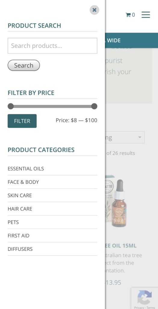
In line with the search function, the filters help your users to find their way through your ecommerce store faster and more easily. With filters, visitors can refine the products in your online store to match their exact needs. Especially on mobile devices, where only a limited number of items would be visible on the smaller screen, it helps if people can filter out sizes, colours or styles that don’t really interest them.
Another big change – and still one of the number one reasons that conversions fall through on mobile devices- form entries. Entering details on a screen can be time-consuming and frustrating, making a lot of visitors leave the platform before converting. A first tip is to include as few forms as possible. Let people visit your website, browse your products and save items without requiring a sign-up process as a member.
Of course, forms are unavoidable at some points. You can’t sell a product or services without people having to fill out some fields. But even here, there are a few things you can do to make this process as easy as possible.
Lastly, there are a few things you can do to improve the usability of your mobile website. First of all, make sure to adapt your design to mobile devices. Whether you chose a responsive design or a mobile website, make sure everything is easily accessible and visible on smaller screens.
Even if your images fit within the screen size, you still have to ensure your users can actually see what is on them. Your users should never have to pinch or zoom to see the actual content, so this means you might have to include expandable images or crop images for mobile use.
Another tip we can give you is that you can include guidelines for your users on how to use your website on a mobile device. You can tell them, for example, to view your website in landscape mode to get a better overview of products or a certain page.
Finally, you want your users to stay within your website’s window. Links that open new tabs are confusing on mobile browsers and users often won’t find their way back anymore to your website. Your website visitors will find it easier to swipe back than to switch tabs on a mobile phone.
To conclude, we would like to include a chapter on mobile marketing in this guide as well. It’s not only your website that should be fully optimised for mobile users, but you should incorporate this mobile-first approach into your marketing strategy as well.
Like we already mentioned briefly in our introduction, the Google search results only show websites that are optimised for mobile. When you’re working out an SEO strategy, your mobile optimisation has a huge impact. You can use free tools like the Mobile Friendly Test to see how your website is performing.
With mobile search results, your local marketing also becomes increasingly important. Google wants to include results that are in close proximity to the user, so especially when you’re running a business with a physical location, you want your local marketing to be on point.
To improve your SEM marketing even more for mobile devices, we can add certain features AdWords has made available for Search Ads on mobile devices. By adding a call extension, users can immediately call your business – leading to a higher engagement rate.
But also on other channels, it’s important to think about the smaller screen sizes. Think about emails, for example, that have to look good on both mobile and desktop screens. Or even just your social media ads, that need to grab the attention of the casual users scrolling through on their smaller screens.
Lastly, think of the extra advantages that mobile can offer. With apps, you can install push notifications, which will get the immediate attention of your users. But also text services like SMS have a very high opening rate and could be ideal to include within your marketing strategy.
Search engine optimisation is changing fast in 2026. Fox & Lee’s complete guide covers everything from Core Web Vitals and keyword strategy to AI Overviews to help businesses rank higher.

Compare top WordPress Care Plan providers in Melbourne. See Prices, Inclusions, Experience and Customer Reviews.

What Australian businesses need to know about WordPress in 2026 — from Full Site Editing and real-time collaboration to smarter WooCommerce and tighter security.

© Fox & Lee Holdings Pty Ltd 2026